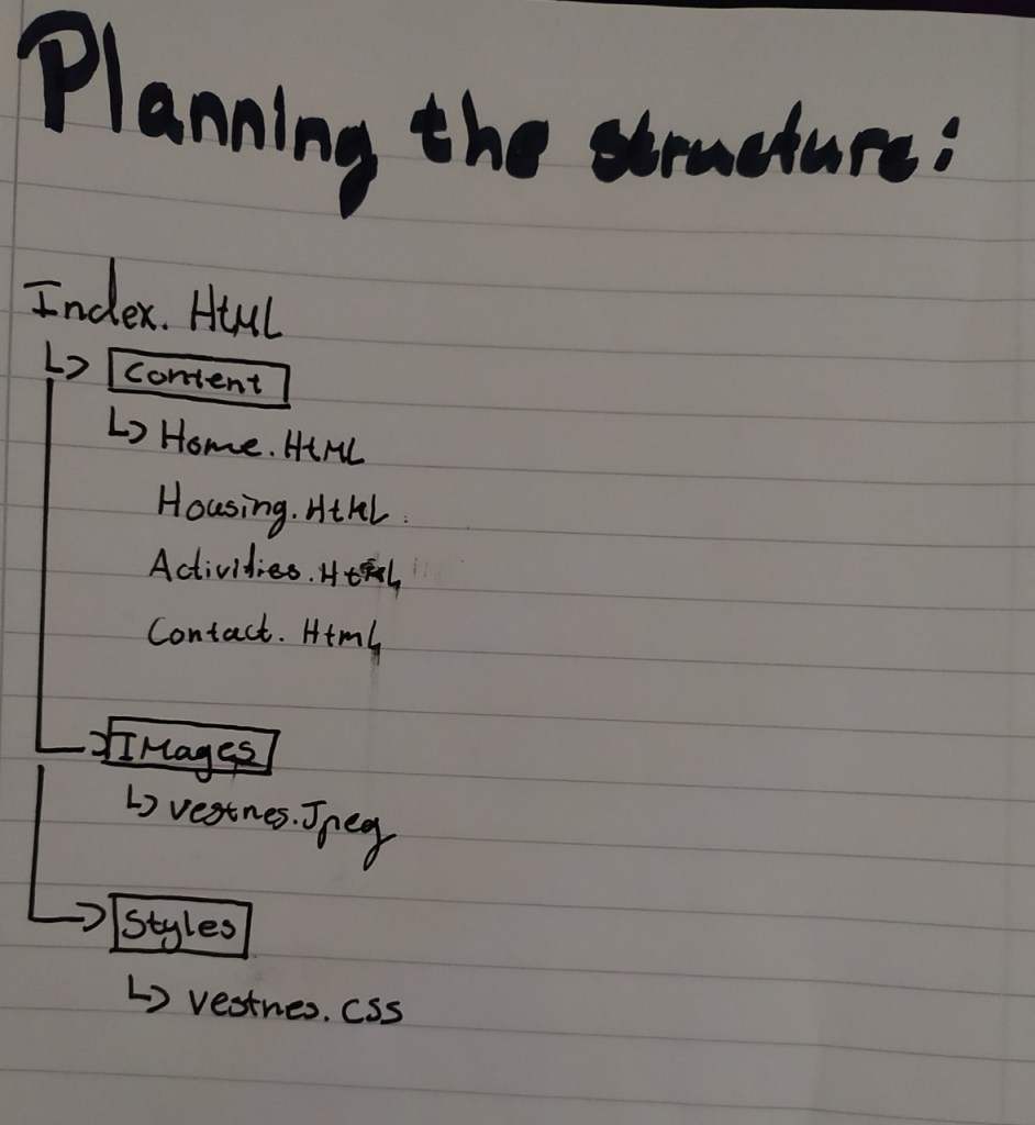
Create the structure of your web page (from Lesson Task – Put Thought Into Your Design) in terms of HTML files and folders. You need to set these up so that you are ready to code your website.
First use a pen and paper to do your planning; then do it on the computer when you are sure of your structure.
Please upload this activity to your WordPress blog. Remember to scan (or photograph) and include your initial planning that you did on paper.
Name two light modifiers and explain the difference between them.
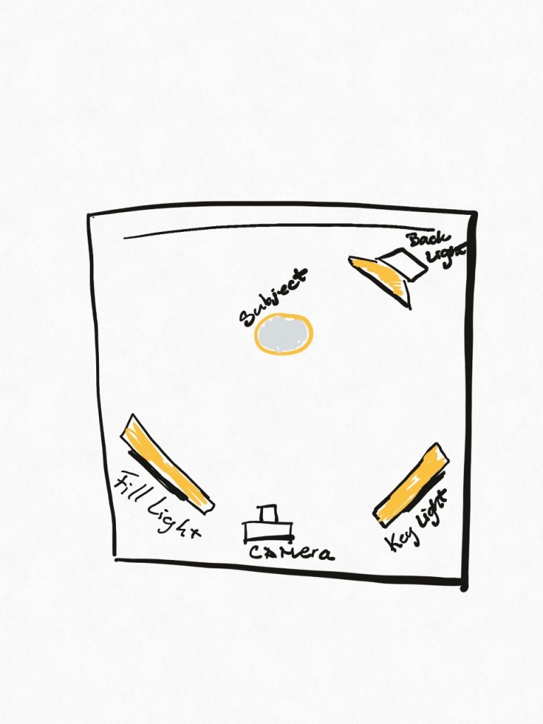
Draw a diagram of and describe the three-point lighting setup.
Question 2 (2 hours)
Research Assignment
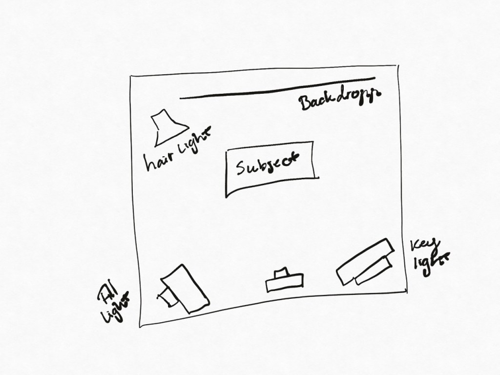
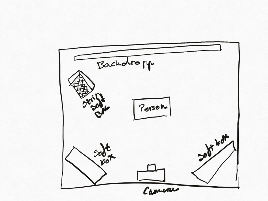
Draw three studio setups for the following subject matters and list all the equipment that you would use to light your subjects:
Portrait
Fashion
Beauty
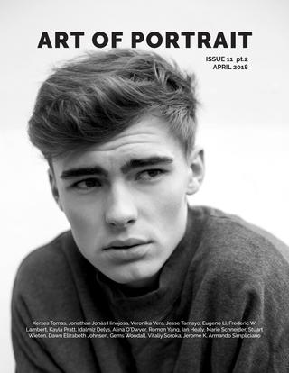
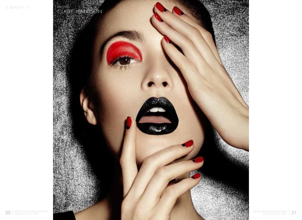
In a magazine or on the Internet, find one fashion shot, a beauty shot and a portrait shot and explain how you think the lighting was set up in each shot.
Question 3 (2 hours)
Practical Assignments Take some portrait shots and pay specific attention to the lighting you use. Do one shot with soft lighting and one with more dramatic, harder lighting. It would be beneficial to hire studio lighting, but if you can’t, you may use natural light, reflectors and your camera’s flash.
Question 4 (4 hours)
Practical Assignments Choose a portrait photograph from the ones you took in Question 3. Create a unique movie poster for a fictional fantasy movie of your choice. Make use of different backgrounds and editing techniques you have learned.
Name three lighting sources and their functions:
Key light is considered the main light in photography, espcially in scene lighting. Key light gives the picture a defining highlight and shadow areas. Other light sources are usually built around the key light.
Flight light is often mixed with key light, though its not as bright. This light softens the shadows from the key light.
Back light use key light and fill light to make your model/object, stand out from the background. Otherwise called hair light/seperation light.
Name two light modifiers and explain the difference between them:
Reflective umberellas are usually mounted in such a way that the light reflects away from the subject. light will hit the inisde of the u,mbrella and reflect off. Usually the umberellas are either white, silver lined or gold. depending on the cold and warmth you want in the photo you should switch around with these.
Softboxes are reflective boxes, usually light weight. These come in diffrenet shapes and forms. light gets reflected between the walls of the softbox. creating a soft light.
Name two light modifiers and explain the difference between them:
Reflective Umbrellas produce a diffused and soft light due to the larger size of the reflecting surface. They are mounted in such a way that the strobe light is actually facing away from the subject or model. Light flies from the strobe head hitting the inside of the umbrella and then bounces back towards the subject. There are silver-lined, white, and gold tinted umbrellas. Silver-lined umbrellas are the most efficient and can focus light more narrowly than the other types. White umbrellas offer a wider spread of reflected light, and gold umbrellas produce a warm tone.
Softboxes are lightweight boxes with a reflective inside and a transulent front. Softboxes come in different shapes and sizes and are attached to the front the strobe over the light source. Light emitted from the strobe head gets reflected inside the walls of the softbox and diffused through the box’s translucent front creating a soft, but more focused light source illuminating the model or scene.
Draw a diagram of and describe the three-point lighting setup:
2. Research Assignment
Draw three studio setups for the following subject matters and list all the equipment that you would use to light your subjects.
Portrait
Fashion
Beauty
These are three of many setups i found on ther interwebs.
Magazine or Internet Shot
In a magazine or on the Internet, find one fashion shot, a beauty shot and a portrait shot and explain how you think the lighting was set up in each shot.
Portrait
In this one i think a keylight is used at the side of him, and umberellas are used to adjust the lighting and shadows.
Fashion
Here i belive they relied a lot on natural light from the outside, but also used umberellas to adjust the softness aand brightness of the light.
Beauty
Here they have played with the shadows, getting the light centered on her face.
Question 3 (2 hours)
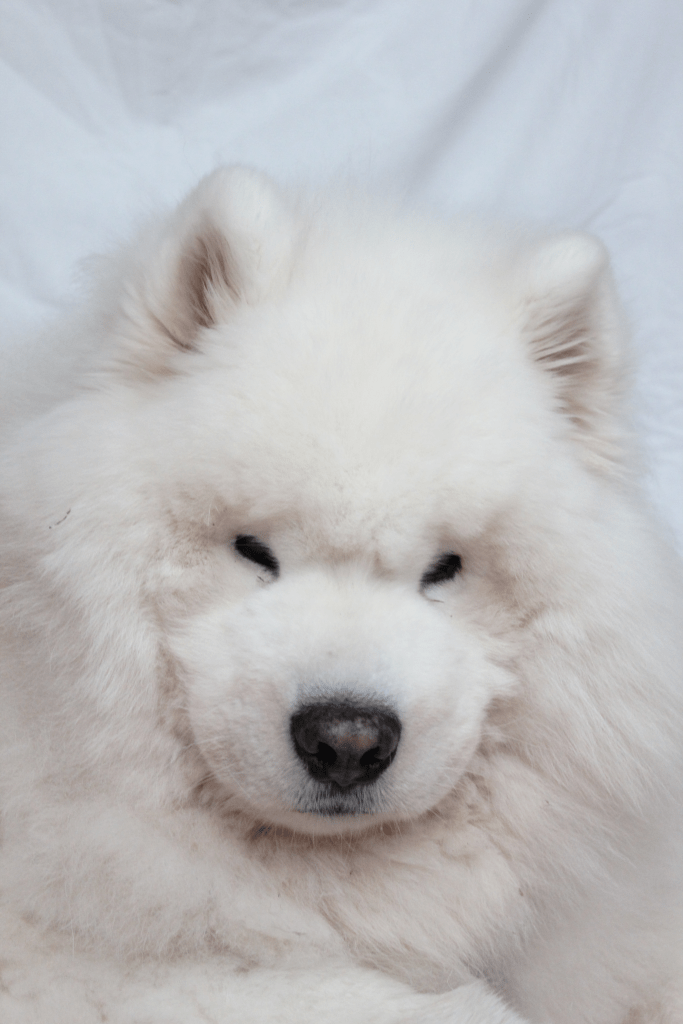
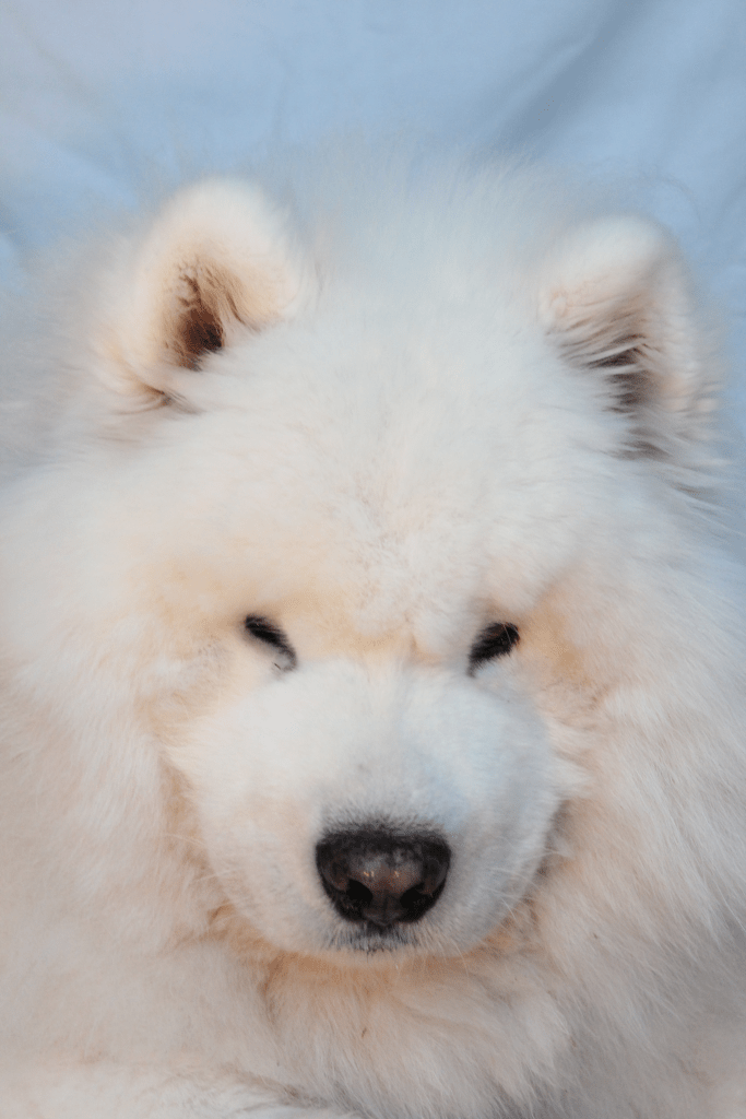
Practical Assignments Take some portrait shots and pay specific attention to the lighting you use. Do one shot with soft lighting and one with more dramatic, harder lighting. It would be beneficial to hire studio lighting, but if you can’t, you may use natural light, reflectors and your camera’s flash.
This image uses very cold and harsh lighting, more dramtic.
This image uses warmer and softer light.
Question 4 (4 hours)
Practical Assignments Choose a portrait photograph from the ones you took in Question 3. Create a unique movie poster for a fictional fantasy movie of your choice. Make use of different backgrounds and editing techniques you have learned.
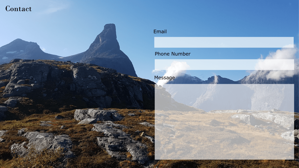
Design a 5-page website or blog to promote your hometown (or any other place if you so choose). Present your design along with a strategy that explains the decisions you’ve made during the design process (keep the six steps mentioned in the lesson Web Design Process: Designing for Web (part 2) in mind). Remember, it’s important for us to see how you think, so explain why you decided to do things the way you did.
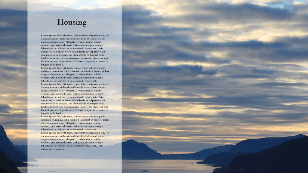
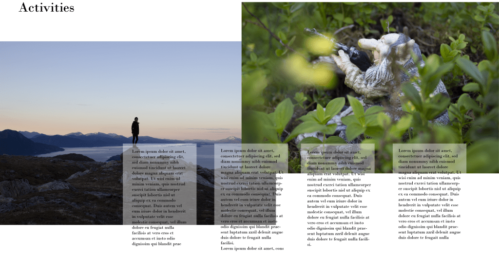
Lukely here i have a lot of photos i have taken troughout the years. I am lucky enough to live in a place that has lovely nature, and lots of mountains. I wanted to present the beautiful nature that is here.
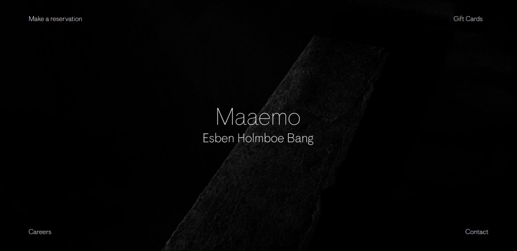
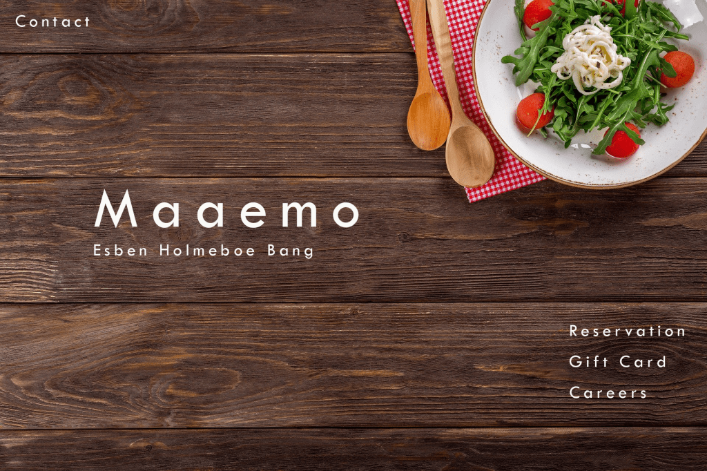
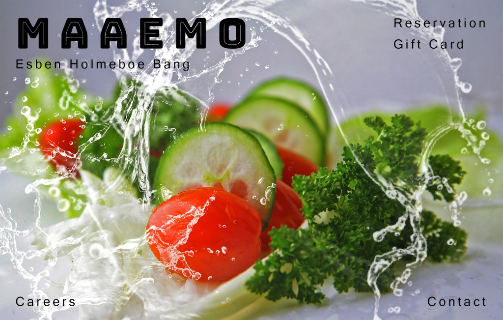
Copy the exact content from a homepage of a website of your choice. Now redesign this homepage in three different ways. Each design should evoke a different emotional response from viewers. You can choose what you would like these emotional responses to be.
This is the web page i decided to use in siad Lesson task. It was a very fun task to play with and im quite happy we got to try this.
Nr 1
This one gives off a more homemade feeling, and is a very diffrent yet simple design from what they originally have on their own page.
Nr 2
This one gives off a more rpoffesional site, showing the chefs work. And gives the audiance a feel of proffesionalism.
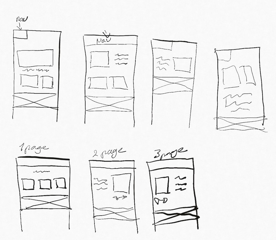
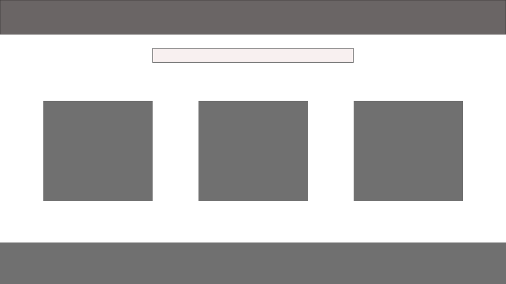
Now it’s your turn to create your very own website wireframe.In the last task, you had to come up with a list of 10 questions for a briefing form. I would like you to now fill in this briefing form, take the answers and create a wireframe for the site.This wireframe do not have to be a wireframe for your current Course Assignment (Product Website) it’s purely for you to practice your skills.You can choose if you want it to be a lo-tech or hi-tech architecture. Regardless of which method you choose, I would like to see as much detail as possible. Also, please write a short paragraph to explain why you chose the lo-tech or hi-tech option.
I choose to draw sketches on my IPad
The 4 on top is me playing with deisgn ideas while the three on the bottom is how i wouldve set up a potential website, and pages linking to the main page (page one)
Explain the following terms in your own words: – The Internet – HTML – Browser – Search engine
Please research and add another 10 questions to the briefing process.(See the lesson.)
From this list of 20 questions (your 10 added to my 10), please create the ultimate list of 10 questions that you would use for clients.
Please upload this activity to your WordPress blog.
–The internet: A world wide metric of computers.within this metric you will find personal computers, main frames, software, tablets or any other device you cann connect to the Internett. The main purpose of the internet is to share information.
–HTML & Browsers: The universal language that is used to retrive, present and send information via internet. In order to veiw these HTMLS we need a browser, such as firefox, opera, explorer and chrome. Browsers and the internet wouldnt be able to function without the HTMLS.
–Search engines: A search engine is a program that looks for keywords in a HTML document. The program then gives you the best result matching your search. Google and BInge are two very popular search engines.
10 most optimal questions:
Who is the target audiance/client?
Who are the competitiors?
What web host is used?
What are some websites you like? explain why
What are some websites you dont like? explain why.
What are some design elements you would like to keep on your web page?
Do i need to create or do you have any images for the websites? if so how will they look?
Do you have any colour prefrence?
Who will be the contact person for this project? and wh will have access to the page?
who will be responsible for maintianing the website?
Part twoSurf the web and find 10 sites you would consider to be great websites. Simultaneously, make a list of 10 sites you consider bad web sites. Remember to describe why you would define them as such. Upload your lists on your blog.
https://www.caffeineinformer.com/death-by-caffeine I like this website as it lets me calculate the amount of coffee i should drink, it is also set up in a simple easy to understand way and straight to the point. Lots of white space used to make it look cleaner
https://screamintothevoid.com/ The usage of this age is to let out feelings that furstrates the user. The layout of this page matches the spiral of emotions one can feel when needing to let out steam and is there for a very good choice for this sort of web page. Its easy to navigate and use.
https://www.instructables.com/ this is a DIY page, that is clean, minimalistic and very easy to use. I like pages giving toturials on these kinds of projects in a easy to understand way. The layout fits great for its purpose.
https://quickdraw.withgoogle.com/# this is a fun page that helps the google AI to learn. I like the usage of colours nad the illustration for this page. It gives the page a very playful look.
https://thetruesize.com/#?borders=1~!MTU1NDQyNjA.NDkzNzA3OAMzIwOTg0MDg(NTM5MzcyMQ~!CONTIGUOUS_USMTAwMjQwNzU.MjUwMjM1MTc(MTc1)MA~!INNTI2NDA1MQ.Nzg2MzQyMQ)Mg~!CNOTkyMTY5Nw.NzMxNDcwNQ(MjI1)MQ this page is informative to figure out how big countries really are compared to one another. The lay out consits of the world map and simple instructions. It is very straigh forward and i like that.
https://www.nowness.com/ i like the use of white space and way they have put up the layout. however i think they also could do improvements here.
https://www.amazon.com/ Amazon is a straight forward easy to use site, where you can purchase stuff from other places in the world. It does not have much white space, but it fills the information out in a clear way and keeps it simple for the user.
10 Bad Websites:
https://theface.com/ This page has no whitespace, the flowing text is distracting. The image under the text makes it more distracting and the colours clash too much in my opinion.
https://jamilin.com/ this page is a big mess, nothing is orderly and i struggle to manage my way around this page. The colour pallette used is not matching and too distracting to even strat with the typeface.
http://www.arngren.net/ this page just confuses me and i feel like i as the audiance have no idea where to even start looking here or what to do. This layout is too cramped and ust overall incredible bad.
http://www.rudgwicksteamshow.co.uk/ too many typfaces used, and too messy to even begin to navigate. a lack of white space and colours that does not fit in at all.
https://www.art.yale.edu/ the moving text and images in the background is again too distracting with this one. My eyes does not know where to see and i feel confused even looking at this design.
https://www.bobsaget.com/ This site was easier to navigate, and it is possible to find the information needed. However the layout of this site is very messy, and distracting. The elements are not structual and very off grid.
https://torontocupcake.com/index.html this page lacks a proper heading, i fail to see what its supposed to be about. The logo is repeated on the page but it is very unclear to find. The overal layout is too confusing and risky.
https://nwokillers.weebly.com/ The layout for this page is fine, but the images used are too confusing. The colour palatte is outdated and so is the fonts.
https://www.exeloncorp.com/ This web site lacks an overall contrast between its elements and whitespace, im confused looking at this site.
https://www.theworldsworstwebsiteever.com/and ofcourse this gem, it is too distracting with all the sparkling elements. The colours used are too distracting, I dont know where to begin orr stop at this page. The layout is outdated and too messy, everything is offgrid and too many typefaces are used.
Practical assignment (observation and analysis (3 hours)
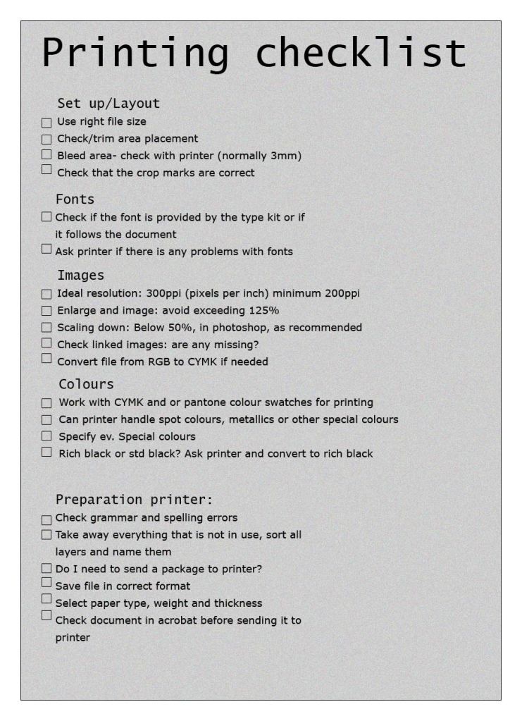
Design your own printing checklist form.
Question 2
Research, written and practical assignment (problem solving) (1,5 days)
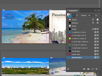
Use the magazine style brochure that you designed in Module 5. Add a spot varnish to the cover and change the design to use spot colours. (You are welcome also make layout changes if you want to.) For your magazine, use a spot varnish for the cover and design it using two spot colours.
Make use of your checklist that you designed and prepare the file for print.
Decide what paper weight and type you will use.
Decide what type of binding you will use, for example, saddle stich, perfect bind, etc. (See the printing terms link.)
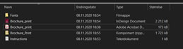
Upload the print-ready PDF to your blog and post screenshots of your packaged files, and instructions.
For this task, i used the printing checklist i made to make my travel brochure ready for print. I decided plastic paper like smart flex, would be a good choice, because of it waterproofness and tear-proof properties. This paper is also not too heavy, so it can be sent in the mail.
For the binding i would use saddle stitch. Its a cheaper option, easier to turn pages and works perfectly for smaller objects, like a travel brochure.
Complete the LinkedIn Learning exercise files and submit it with your assignment
There were a lot of files to go trough here, a lot of the information was old and had little learning potential. Which is why i decided to focus more on my other tasks that gives me a lot more. However i did find the time to so one of these, sadly it woulve affected my other work had i priorotized these files.
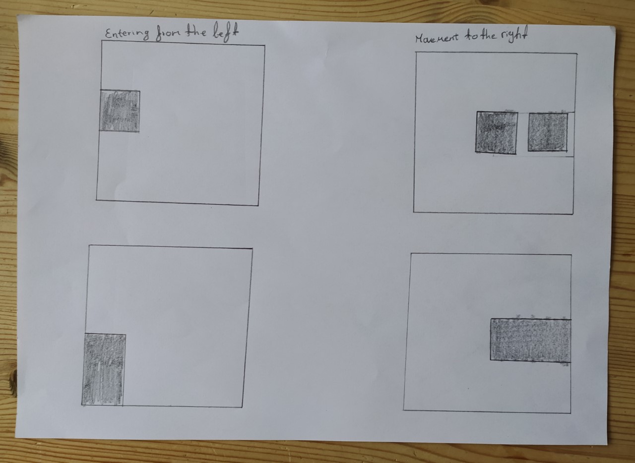
In this lesson task im testing my sketching skills.
On an A4 landscape page, draw four equal squares. Create 4 more pages in this way. So, you’ll have 5 pages with four squares on each.
Draw one or two squares or rectangles in each empty square to achieve the visual effects that you see on the first page of module 3 in Graphic Design School textbook. You can work with the interaction of rectangles and squares to make the balance or imbalance more evident.
Entering left
Movement to the right
Movement to the left
Movement downwards
Movement upwards
Balance
Tension
Symmetry/asymmetry
On the left side, the boxes are entering from the left, on the right side the boxes are moving to the right.
On the left side here the boxes are moving to the left while on the right side they are moving downward.
Here theboxes on the left are moving upward while the boxes on the right are creating a balance.
This shows the symmetrical on the left and asymetrical on the right.
Here we can see a bit of tension on the left while the right is showing balance again.
Basic principles of layout
Take a magazine, newspaper or book that includes images and text. Lay tracing paper over the top of three spreads (both left-hand and right-hand pages). Using a pencil and ruler, carefully trace the grid underlying the page layouts. Remember to remove specific text elements or images, and to only draw the grid lines. Note column widths and margin sizes at the top, bottom, and to the left and right of the main body of text. Is your document based on a two-column, three-column, or another type of grid? Which elements stay the same on each page, and which change?
Publish your findings to your WordPress blog and provide photos or scans of your exercise.
Right hand page
Left hand page
Pace and contrast
Compare the design (in terms of pace and contrast) of an online magazine, blog or website to that of a printed magazine, book or journal.
What differences can you see between the kinds of design strategies used in the two formats?
Write down your findings and upload it to WordPress.
Usually for printed magazines you can find they layout to vary, depending on the publisher, environment, and audience they are trying to reach. This makes it very unpredictable to know how a magazine will be seen before opening it. You will often find printed magazines to contain different structures on each page, and in general contain more information then just the theme of the magazine.
Online magazines however should be simple and easy to read. Usually the structure of an online magazine will stay the same, making the pages easier to navigate. This will also make it easier for different devices to open the pages. Good headlines catching the audience attention are also important here.
Form and space
Rearrange shapes cut out of paper, and try to find the point at which the figure disappears into the ground.
Cut out a series of shapes from black paper – squares, rectangles, circles and random shapes – in a variety of sizes, from small to large.
Working with a square piece of white paper, place shapes of different sizes into the white space; place them on the white one at a time and move them around.
Try to find the point where the distinction between figure and ground becomes unclear. Does it depend on which shape dominates the space: black or white? Is it about the position of the shape within the space? Think about how important figure-ground relationships are within composition and design.
Write down your findings, and remember to take pictures of your progress. Submit these pictures and your write-up on your WordPress blog
So i started playing with the shapes to find where it starts to become more unclear.
I thought id also include an example of where the shapes can clearly be distinguished
In these two however, you can see them becoming more unclear.
Here i added siffrent and many shapes, and it became very unclear
Design of layout in InDesign
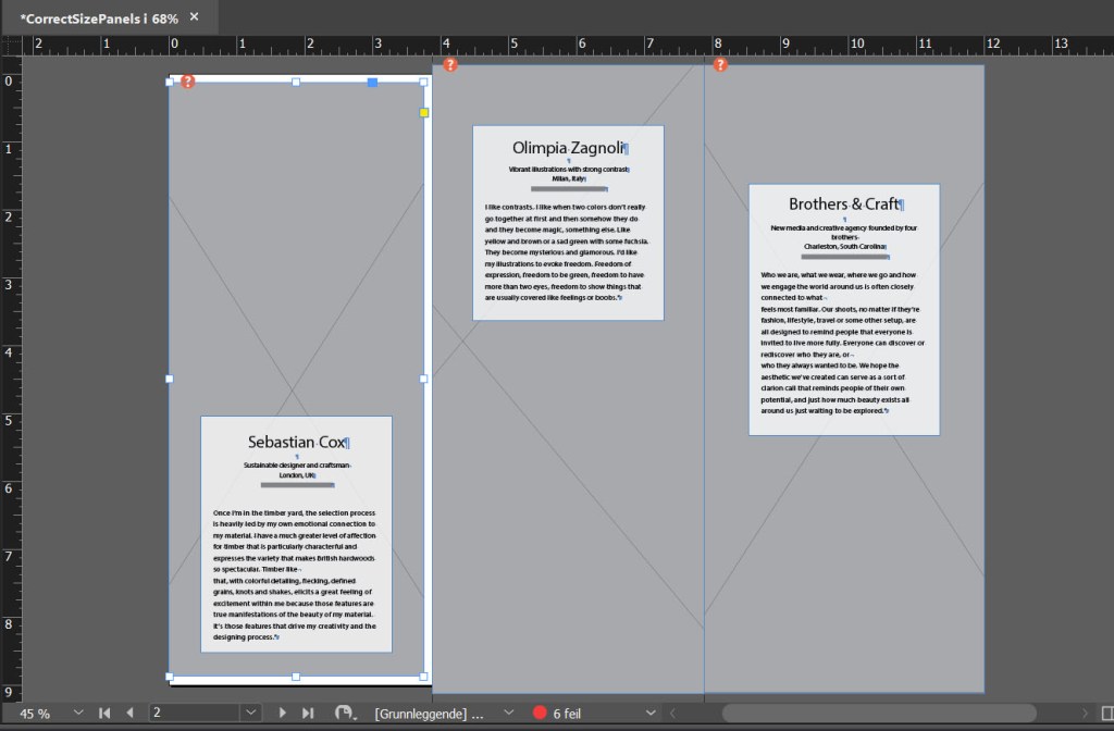
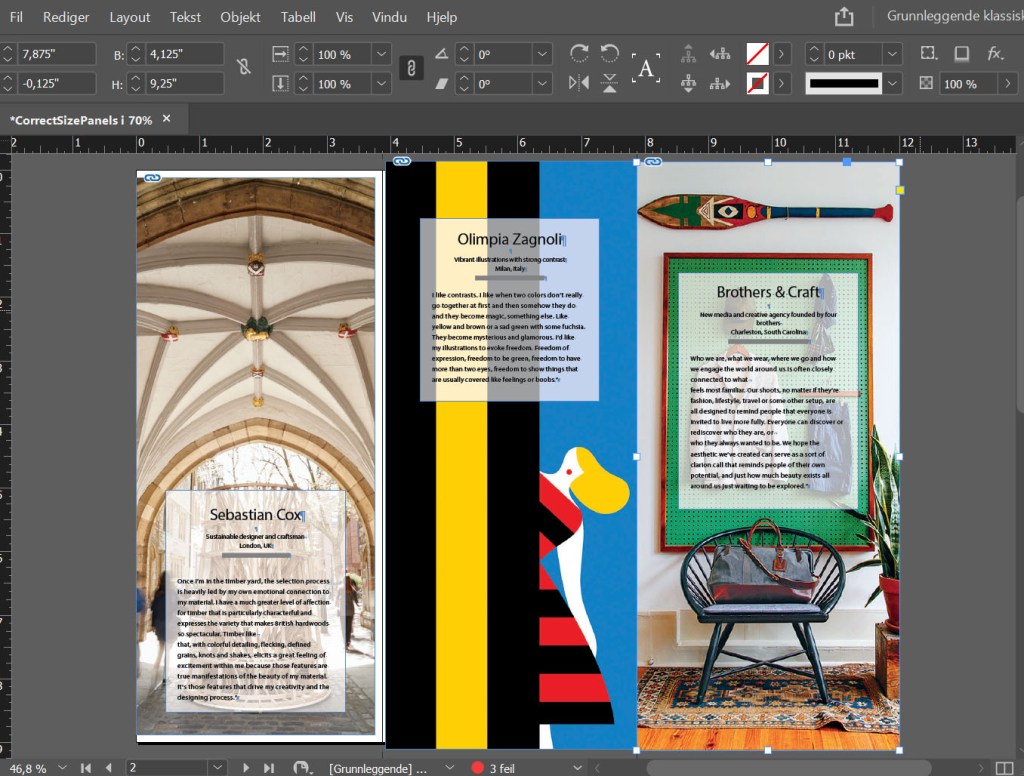
Using InDesign, design a 8-page brochure for a fictitious travel agent.
The size of the brochure should be A5 (when it is folded).
Design the brochure in full colour.
Use fake body copy, but create sensible headings.
Use titles, headings and images of your choice.
Be sure to pay attention to:
Choice of type
Choice of imagery
Use of layout and grid to communicate the content
I chose to upload a pdf of my layout, this is my result
Selecting the proper White Balance: (1 hour) Take your camera outside during daylight and photograph the same scene using different white-balance settings. Move indoors and repeat the exercise with shooting in a tungsten-lighting environment. Finally, find a fluorescent light source and repeat one more time. Pay close attention to how each setting affects the overall colour cast of your images in different lighting environments and write down your findings.
My camera had these white balance settings: Daylight (Approx. 5200k), Shade (Approx.7000k), Cloudy (Approx. 6000k), Tungsten (Approx.3200k), White fluorescent (Approx.4000k), Auto, custom and flash. I have listed which i used on the photos below.
I found that the white balance cahnges the colour depending on which i used, as you can see the tungsten turns the colder, whereas shade gives it a warmer look and so on. I have labeled each photo with the white balanced used, as well as for the pictures taken inside.
Daylight
Shade
Tungsten
Cloudy
Fluorescent
Tungsten
Experimenting with Focus Modes: (1 hour) Change your camera settings so that you are focusing using the Single-Point focus mode. Try using all of the different focus points to see how they work in focusing your scene. Then set your focus mode to AF-S and practice focusing on a stationary subject and then recomposing before actually taking the picture. Try doing this with subjects at varying distances. Lastly, change your focus mode from autofocus to manual focus and practice a little manual-focus photography. Get familiar with where the focus ring is and how to use it to achieve sharp images. Write down what you learned from the different focus modes.
I found that by messing with the focus points, auto focus nad manual focus, i could more easily get diffrent angels to one photo. I also found that manual focus better helped me focus on the subjects i wante to photograph.
As welll as this i made some reaschearch on the three diffrent focus mode my camera has; One shot, AI focus and AI Servo.
One shot; Point your camera at your chosen subject, half press the shutter button to focus your lens. It will then measure the distance in the photo, before capturing it.
AI focus: Here the focus will be locked on the subject, so even if the subject moves the focus moves with it, and refocuses. This can be a very tricky setting to use.
AI Servo: This focus mode is mostly used for fast action. The camera will try to focus on whatever is in the focus point, trying to pick up the subject. This mode won’t lock into a focus, so you wont hear a beep, the camera will ratehr be in constant movement.
Question 2
Practical assignment (1-5 days) Take five pictures every day for the next five days. The subjects of your pictures can include a series of different objects, people and landscapes. The focus of this activity is to put into practice what you have learned so far about exposure and composition. This includes: Depth of Field, Motion Blurr, High Key, Low Key, Pattern, Symmetry, Texture, Lines, Framing, Perspective, Space, Balance and Colour. Apply the manual settings as explained. Submit your six best pictures at the end of the week, listing the following with each picture:
Research, written and practical assignment (4 hours)
Throughout this lesson you’ve learnt about the various techniques used and inventors that contributed to the art form that is Photography. Choose only one, do some additional research and in your own words write a report on why you think the chosen technique contributed to what we are able to do today through photography.
Explain your research and choice of technique.
Include any images which you think are necessary to explain your thought process.
This should be 500 – 1000 words.
Through this lesson we learned about photography history, different techniques and the inventors of the techniques. I choose to do a little bit more research on the Calotype, invented by William Henry Fox Talbot in 1835.Below i have added a PDF showing my reasearch. The sources can be found at the bottom of this blog post
After watching the video: Introduction to Photography: The Camera by Ben Long (1h 52m), please answer the following questions. If necessary, refer to your Camera Manual:
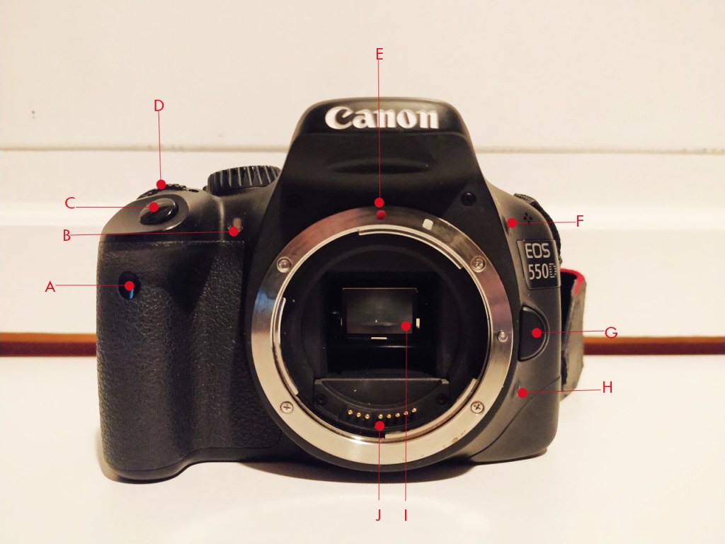
Name all the functions / buttons on the front of your camera
Front
A: Remote control sensor
B: Shutter button
C: Self time lamp
D: Main Dail
E: Ef lamp mount index
F: Manual Blitz
G: Lens release button
H: Depth of field preview button
I: Mirror
J: Lens contacts
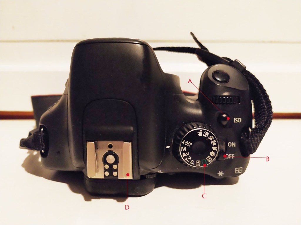
Top
A: ISO
B: ON/OFF
C: Mode dail
D: popp up blitz
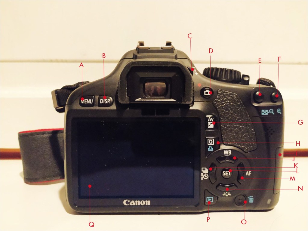
Name all the functions / buttons on the back of your camera
Back
A: Menu
B: Disp
C: Dioptric Adjustment
D: Live view/Movie
E: AE Lock
F: AF Selection point
G: Exposure compensation
H: Quick control
I: SD card slot
J: White Balance
K: Drive mode
L: Set
M: Autofocus mode
N: Picture style
O: Erase
P: Playback
Q: Screen
Explain how you would set the correct ISO
To change the ISO on my camera, all you ave to do is click on the ISO button on top of the camera. Then it will popp up on the screen and you can easily set what ISO you want using the arrow and set button. ISO is important as it helps decide how sensetive the sensor is to light.
Explain how you would change the aperture
To change the Aperture on my canon 550D Camera, you would need to set the dail mode to AV( Aperture value), then you can use the main dail, located behind the shutter button, to decide what aperture you want. What aperture essentially does is decide how the depth of feild will be. In other words, how much of your image is in focus.
Explain how you would change the shutter speed
To change the shutter speed you must first turn the mode dail to M(Manual setting ). Then you simply use the main dail to set the shutter speed.
Shutter speed is the length of time light is allowed to use, when passing trough the lense. If your subject is moving fast, using faster shutter speed will freeze the subject in place. Whereas slower shutter speed creates a blur.
















 stinesreflectivejournal.art.blog