Week 8 Personal logo

This weeks lesson task has been all about creating my own brand logo, inspired by the moodboard i made for myself in week 7 lesson tasks.

Take the moodboard you created in the last lesson task and now create your personal brand logo.

When it comes to determining your personal brand, no one knows better than yourself whether you’re traditional, trendy or tough.

Create a unique typeface accompanied by an icon or symbol that showcases you – or an aspect of you – as a brand. You are free to choose whether you want to add a tag line or not.

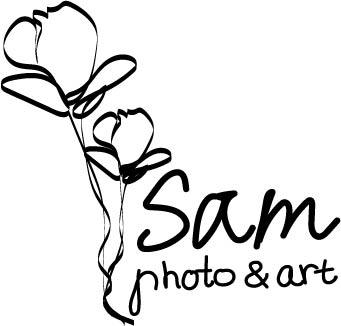
My logo:

A little bit about my logo, I choose to make my logo by hand. Draw the flowers and use my own handwritting as text. This is to give my logo and brand a personal touch as its my creations.

Week 7 Customer profiles and Moodboard

Create two consumer profiles for a fictional client.
You are free to choose the client and the product.

List the things that you think are important to include in a consumer profile and show your research.

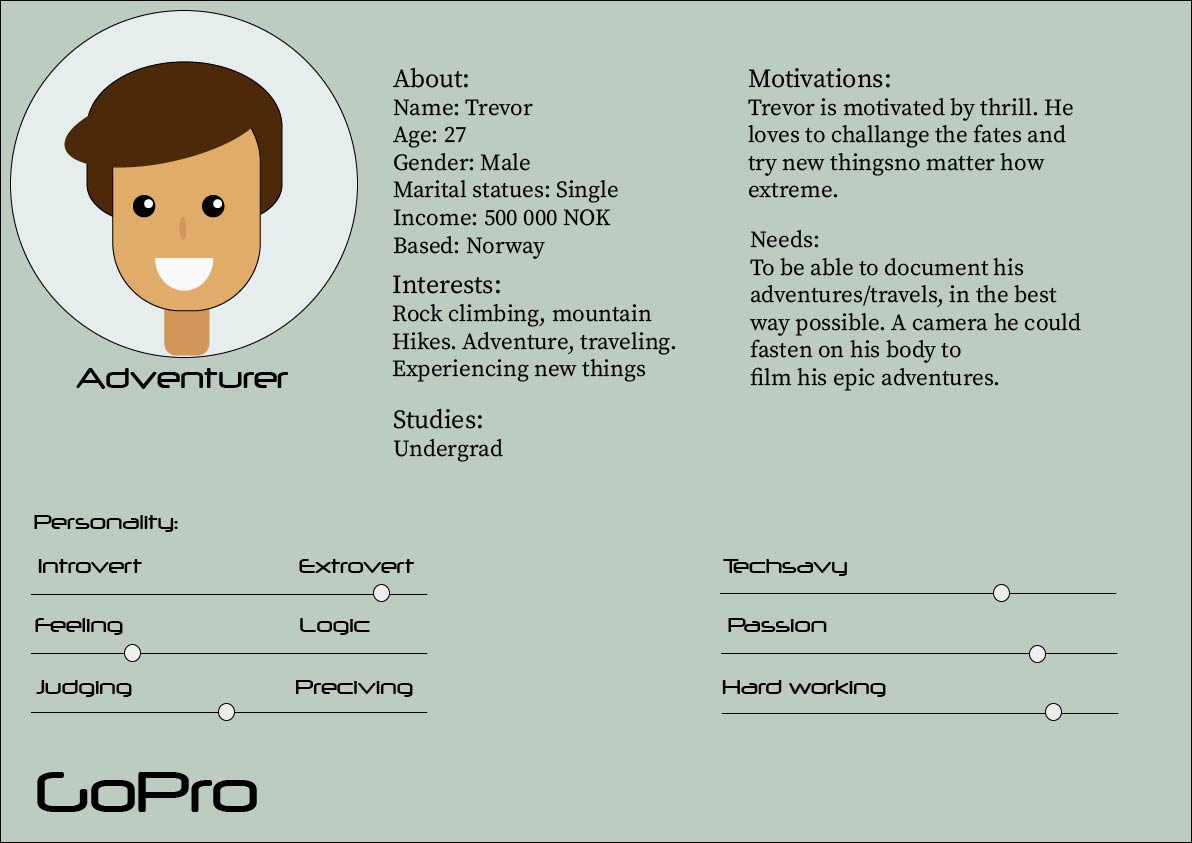
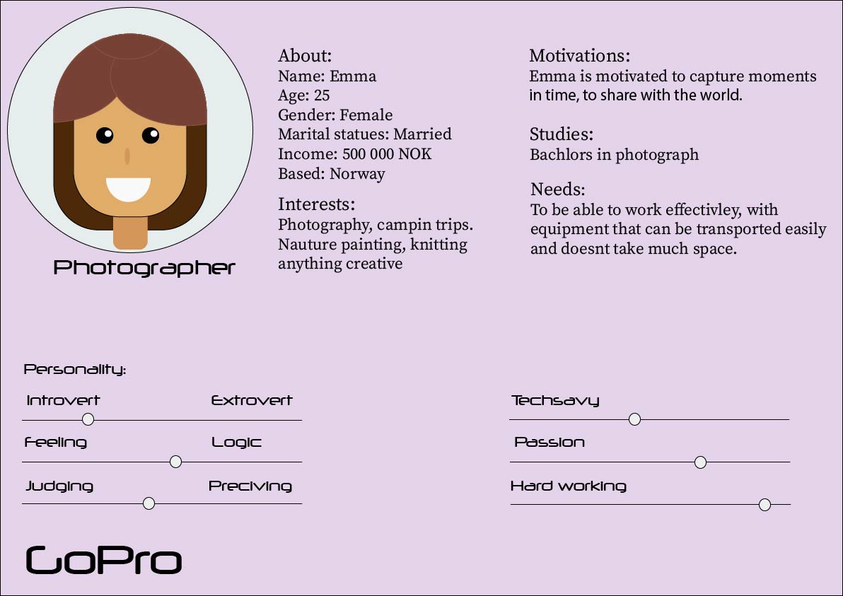
I choose to use GoPro as a example client and product for my consumer profile. GoPro was founded in 2002, originally by Nick Woodman. He wanted a flexible way he could film himself while doing sports, sch as surfing. The first GoPro camera started as a camera and awrist band made from old wetsuits, today however GoPro has grown into a big international buissnes.

This is how my example consumer profiles ended up:


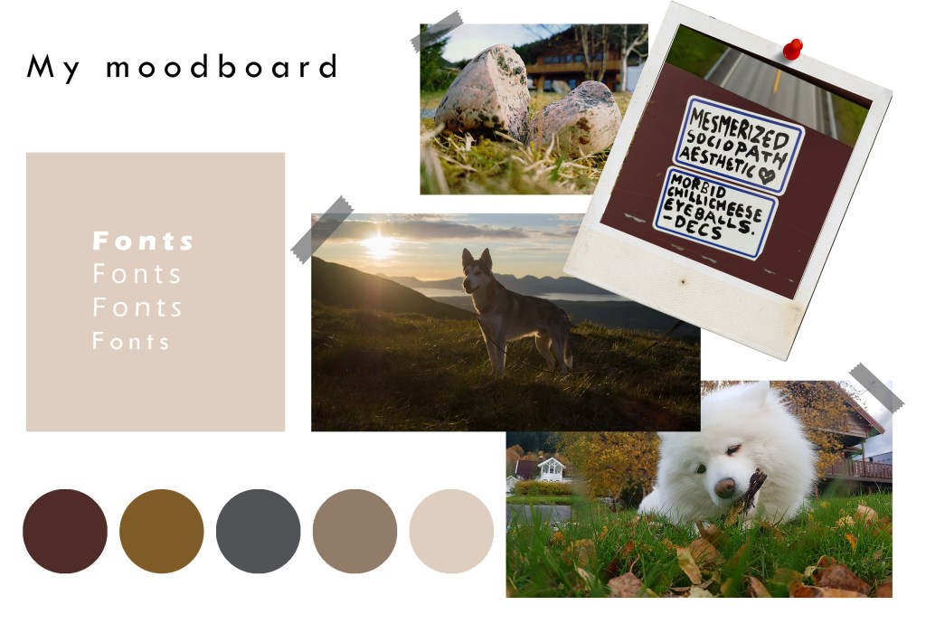
Our other Lesson task this week included making a moodboard

It took me awhile to figure out how to make a moodboard for my own brand, or myself. But i am very happy with how this one turned out.


Sources:

https://gopro.com/en/no/about-us

Book: Graphic Design School by D. Dabner, S. Stewart, A.Vickress

Week 6 Understanding ideals

  • Visit a popular store, like an Apple reseller, Nike, Levi’s, H&M or Ikea. The brand should be well-known and you must visit a shop where their products are being displayed or distributed. In smaller towns you may not have access to these stores, in this case you will need to find a section showcasing these items and view how they are displayed or laid out. Before going to the shop, determine the following about their brand identity and, once at the shop, evaluate how they remain true to their brand identity or how they do not. How is the brand identity enhanced (or perhaps, not expressed) at the point of customer interaction? Hand in a write-up with photos of the following:
    • What brand identity element are they using in their logo (e.g. abstract mark or word mark)?
    • What do you think their brand ideal is?
    • How do they remain true to their brand ideal within their shops?
    • Evaluate the customer experience according to the brand ideal. (For example, if the brand ideal is “innovation”, do you get a sense of that ideal when you visit the outlet?)

Evaluate the visual display of the products according to the brand ideal. (For example, if the brand ideal is “value”, is this expressed in the way they display the products?)

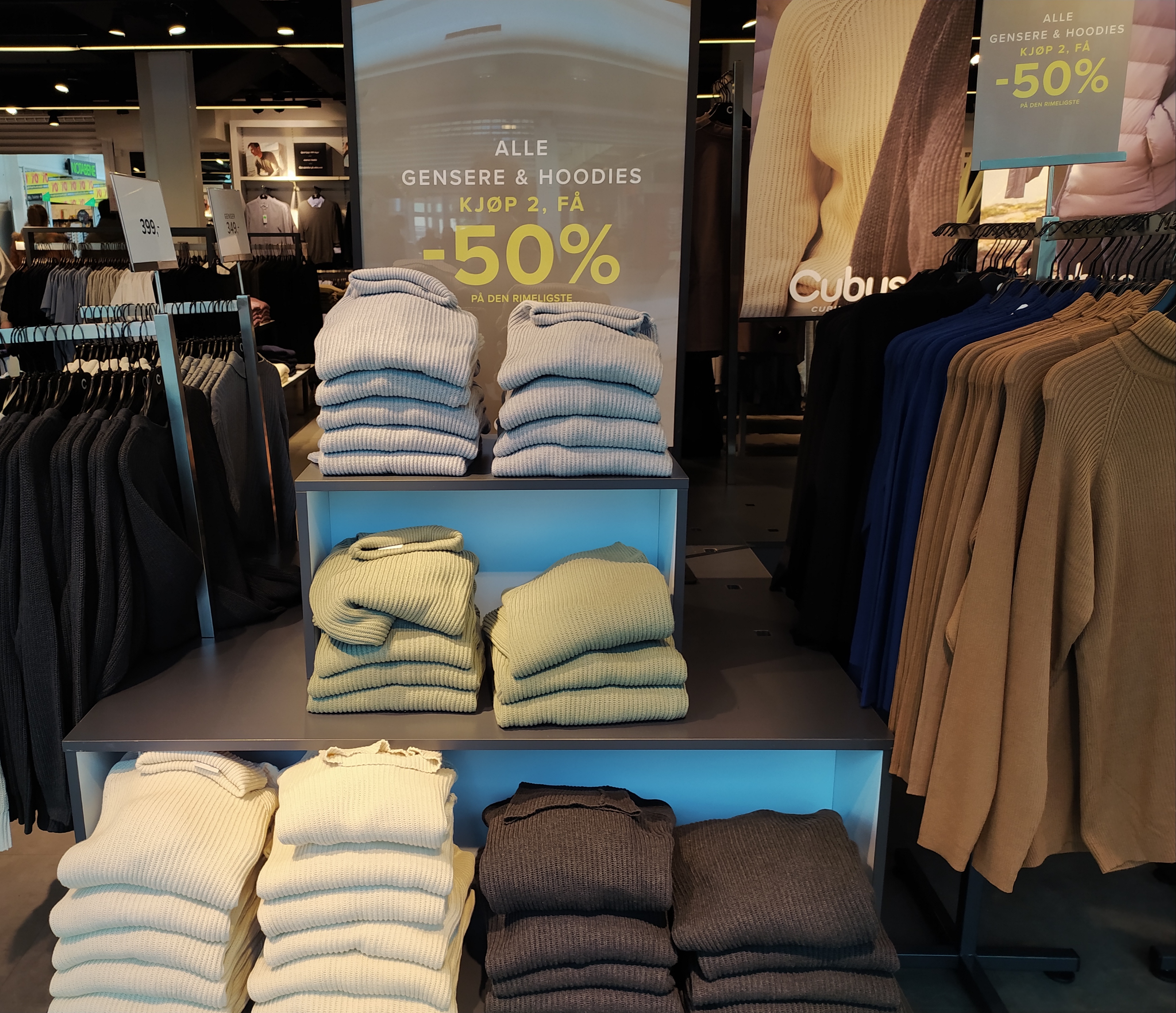
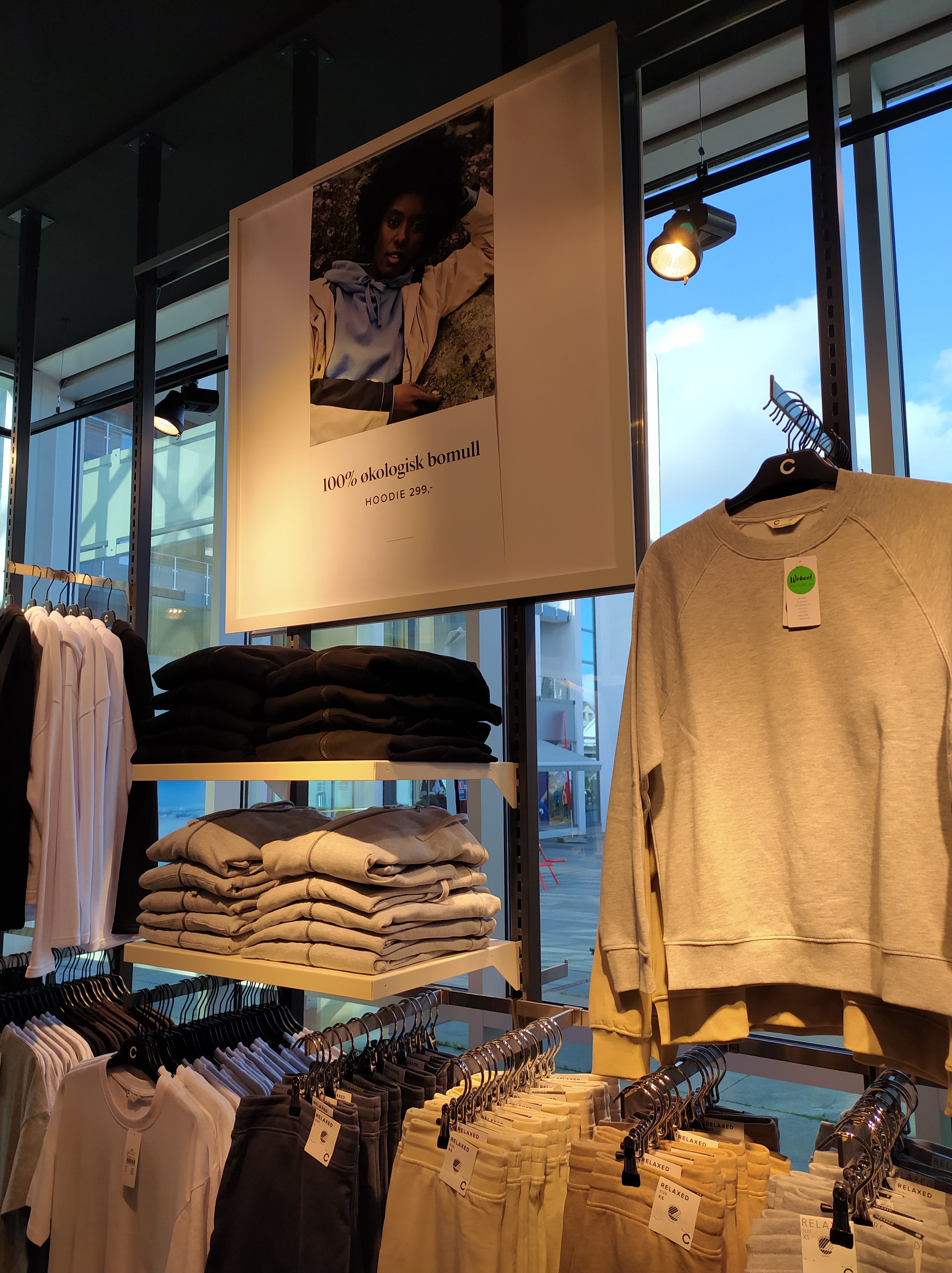
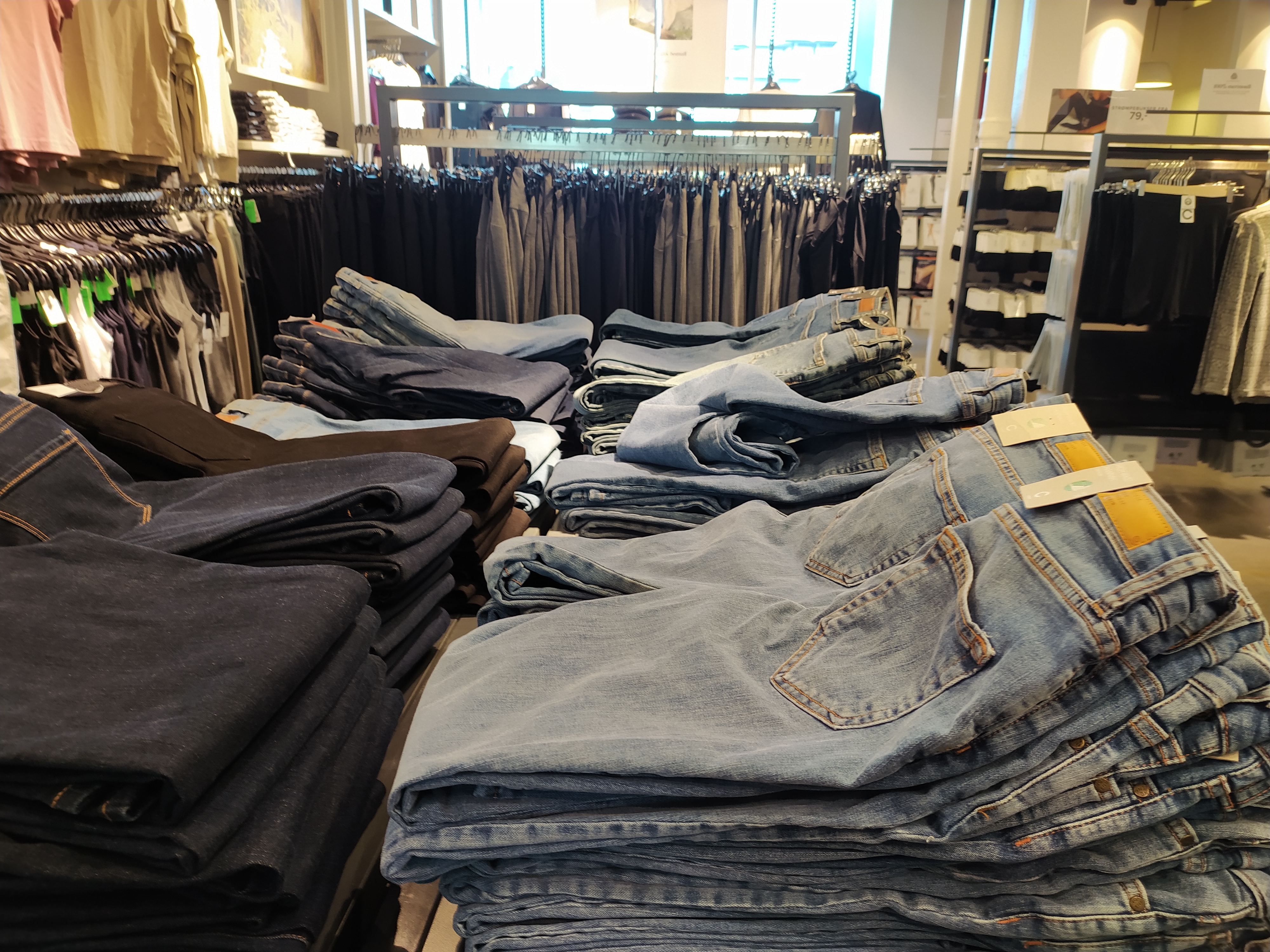
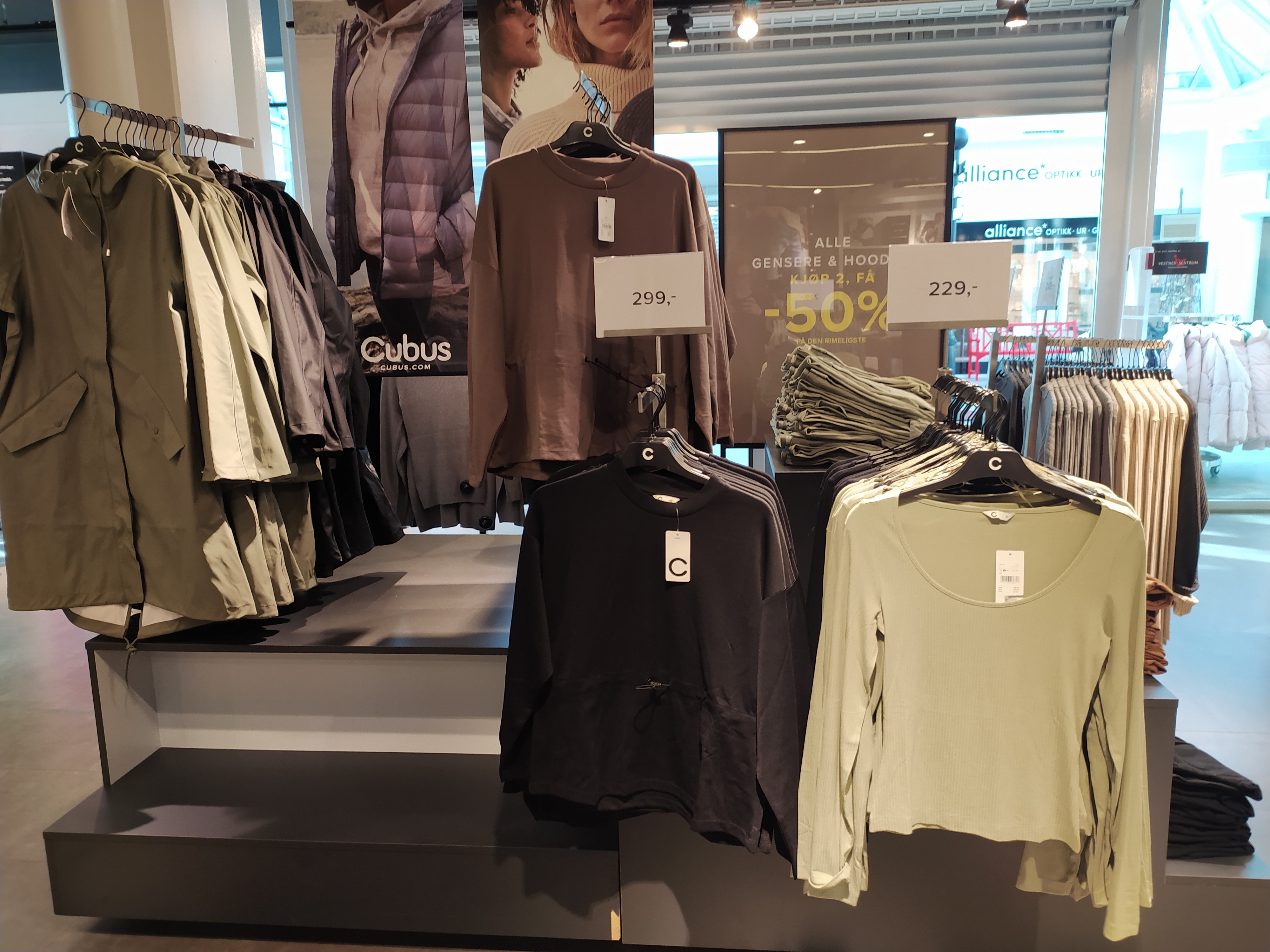
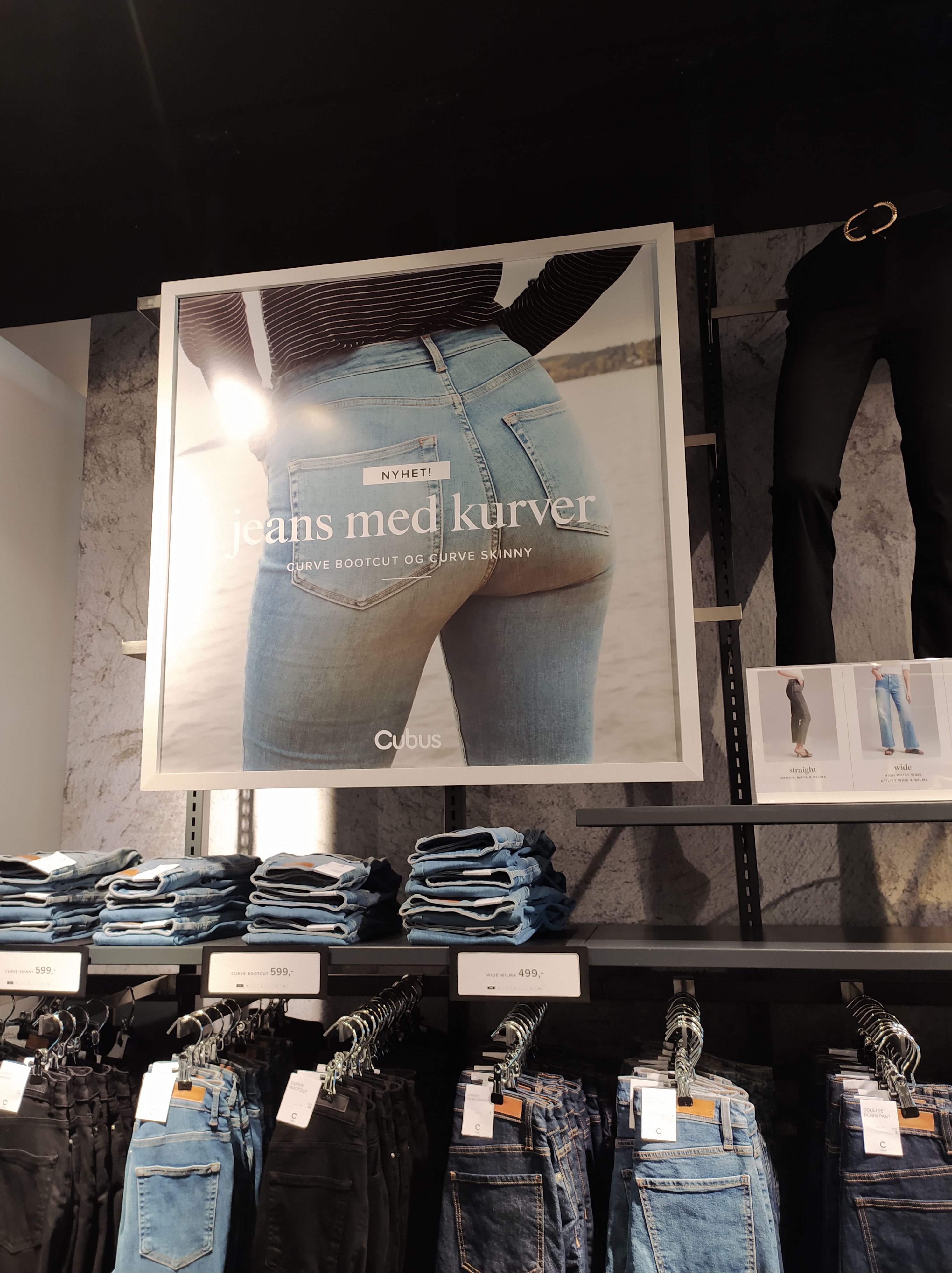
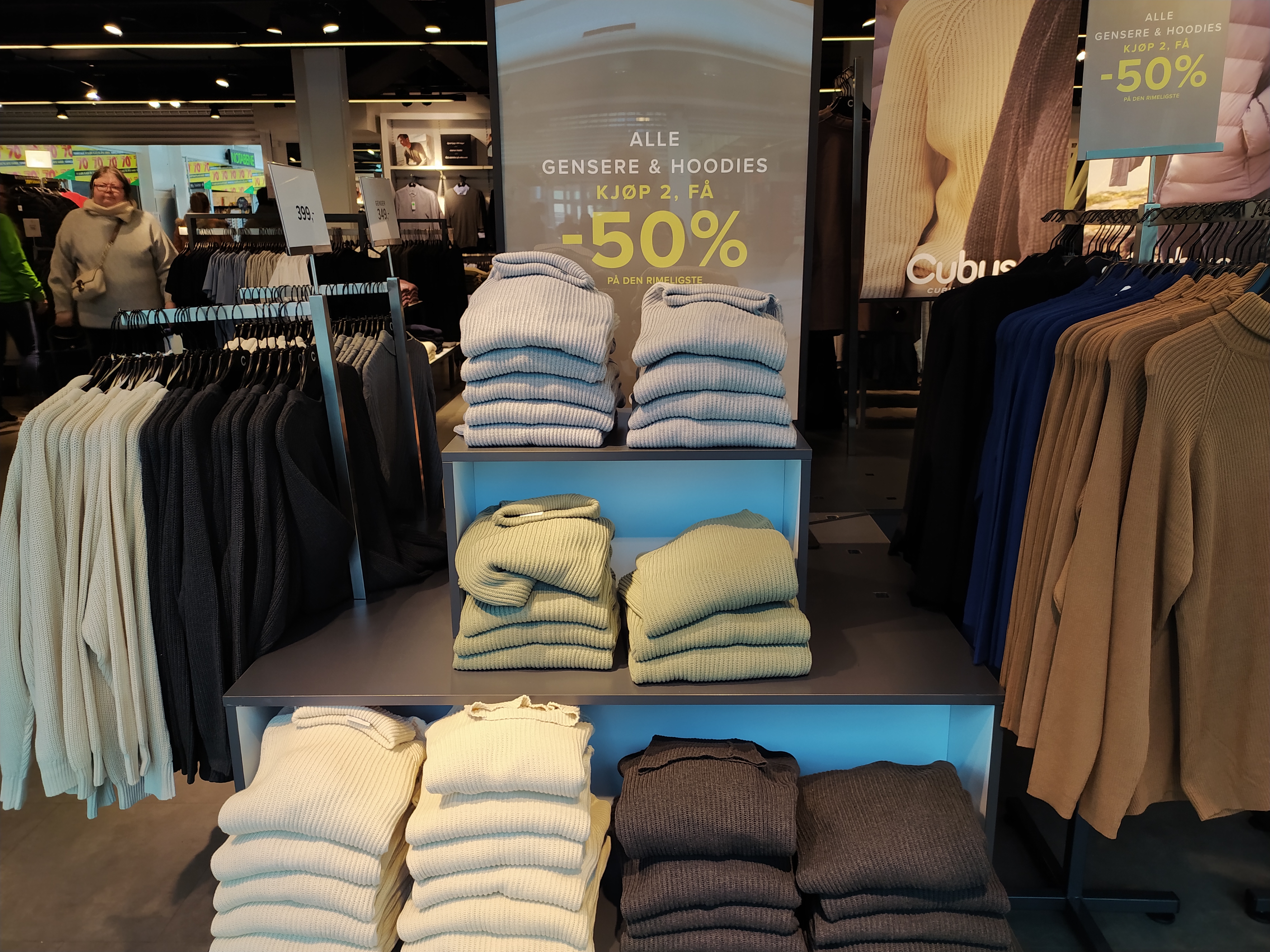
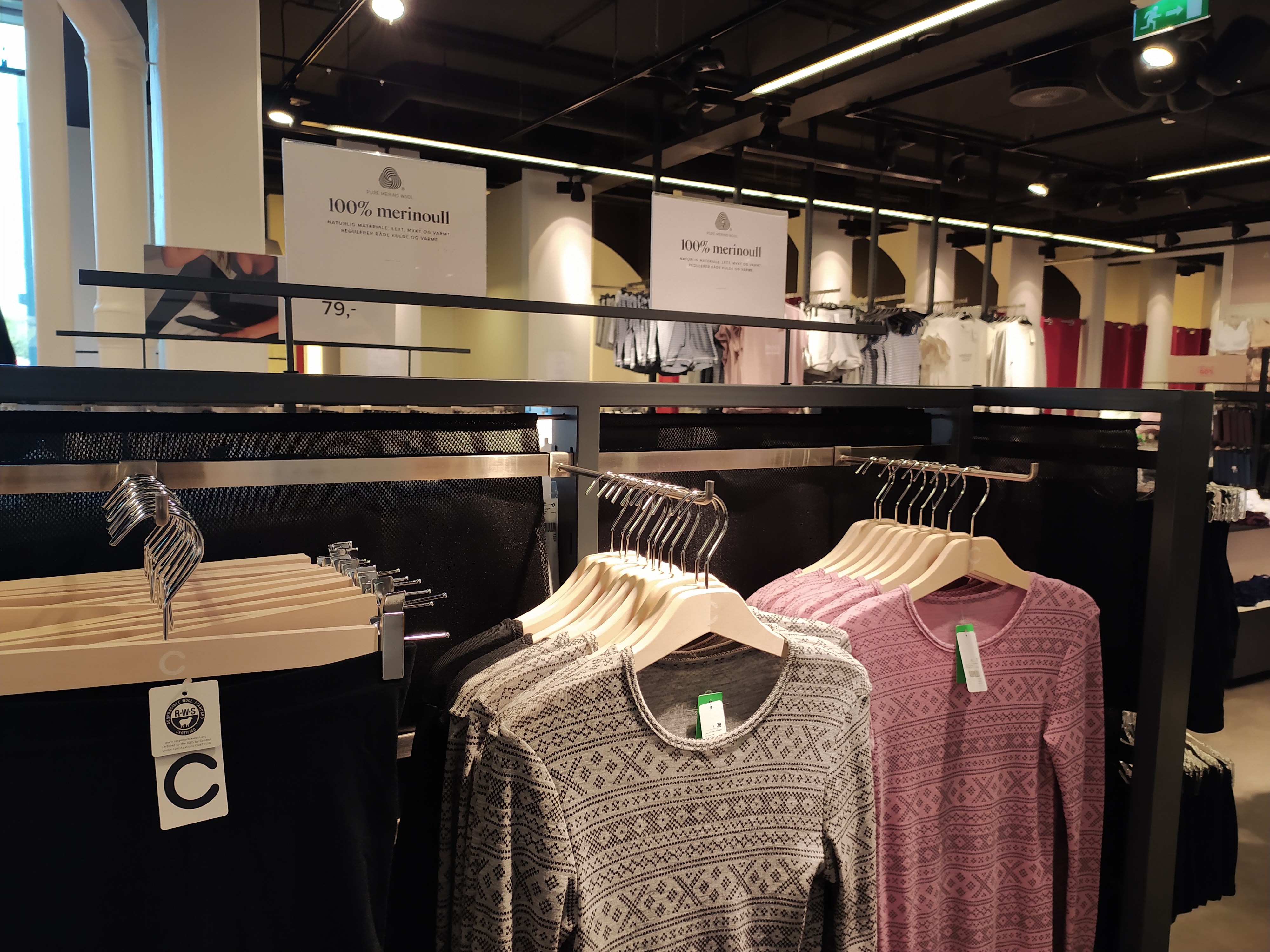
I decided to visit our local Cubus

What brand identity element are they using in their logo (e.g. abstract mark or word mark)?

A little history about Cubus. Cubus is a fashion chain that originally started in 1966, it was later bought by the Varner-group in 1985. Cubus is one of Scandinavias biggest fashion chains with 300 stores spread across Norway, Sweden, Finland, Poland, Latvia and Germany.

The Cubus logo is their name written in a round font. Its a easy and simple design and you can often see it written in white with black outlines or in black. People easily recognize this logo and what it means.

What do you think their brand ideal is?

Cubus puts a lot of weight on customer service, kigh product quality for the riht price and susutanibility.

How do they remain true to their brand ideal within their shops?

To do this i had to visit the local Cubus store and see if they followed the four P’s

Product Their shop is packed with products on their shelf, for men, women and children alike. Their main products consists of Clothin, underwear and makup/hair styling. They have very little accessories available, like necklaces and belts.

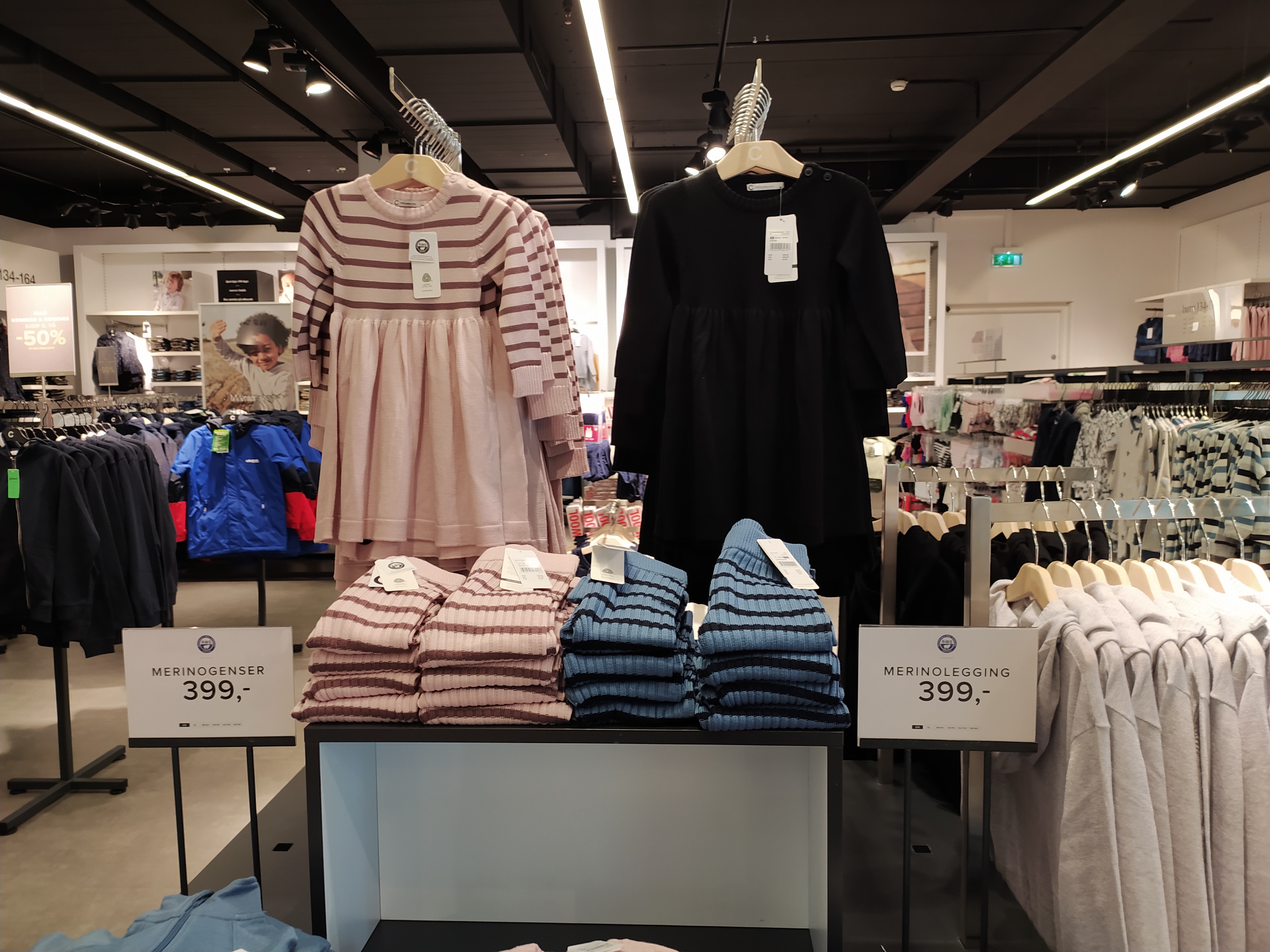
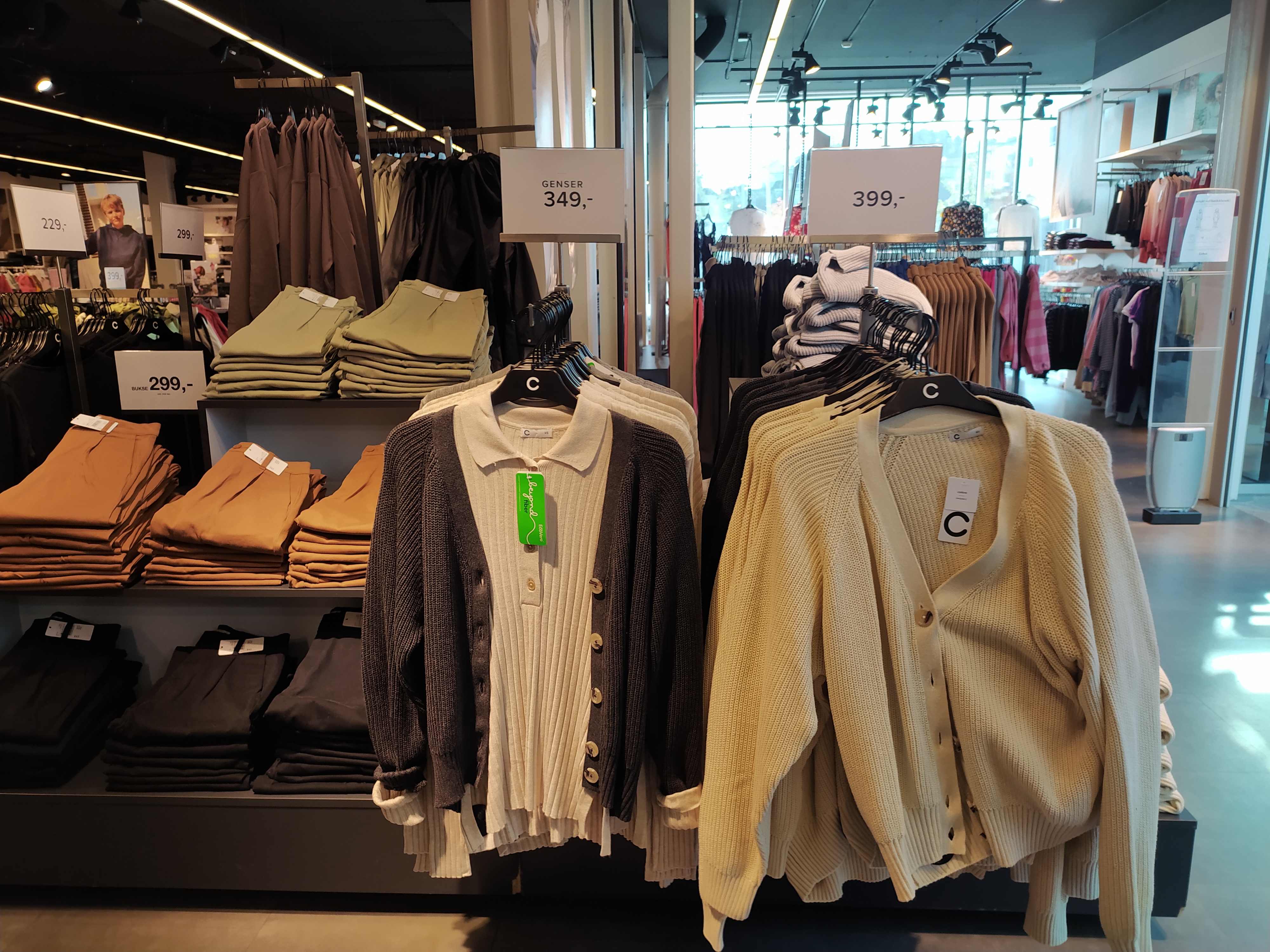
Price: The prices are very easy to find, as each product item usually carry a tag on them letting the buyer know what it costs. Sometimes they will also have big signs with Prices over certain products, thats either there for the season or on sale.

Promiotion: Cubus promotions often focuses on their seasonal outfits and sales. They often show how fitting the products are on the models and happy. People working in cubus also promots their products by wearing them as a work uniform.

Place: My local cubus store is placed in the middle of the mall, it is very hard to miss and easy to spot.

Evaluate the customer experience according to the brand ideal. (For example, if the brand ideal is “innovation”, do you get a sense of that ideal when you visit the outlet?)

This is an affordable clothing chain, that has option for sustainable clothing. They do have signs with hanging around the shop with prices, as well as 50%off and “buy 3 pay for 2” deals on items everyone needs and uses.


Sources

https://www.stortorvetsenter.no/butikker/cubus

https://web.archive.org/web/20120802155807/http://cubus.com/no/Bedrift/Om-Cubus1/Om-Cubus/Historie/

https://snl.no/Cubus

Week 6 Understanding positioning

Look at the following logos and explain in your own words what you consider their positioning to be (do this for each one).

For this we where given the logos of Instagram, Mercedes and Mastercard

Instagram: Instagram is a social platform for anyone doing hobbies, photography, videography, cooking etc. A place for people both amature and professionals to share their photos or short videos. It is a phone based app thats simple to use and easy to naviagte. Their logo is symbolic abd shaped as a camera which for me captures the brand identity.


Mercedes: Mercedes, also known as Mercedes-Benz is a german car brand, this is a brand i see often, as many drive it where i live. It is also a car brand that focuses on luxury, safety and quality. They are durable and because of this taxi companies often use Mercedes.

Mercedes has a simplistic and easy design, a three pointed silver star thats easily recognisable.


Matercard: Master card is a credit card brand, i often see adds for them trough my bank. It is one of the largest financial service today. It is well known trough out the world and most services excepts master card, when shopping online or while traveling. Matercard is a safer option to use while traveling as its money you borrow and will keep your debit card inofrmation from being stolen.

Mastercards logo is symbolic, it consits of two circles overlapping, like a venndiagram. For me this could reprensent the two parties involved, you and the bank you borrow money from, while the middle part consist of your agreement of usage.


Let’s work backwards! Look at the logo on the Apple iPhone and, by doing your own research, investigate the history of the product and the company that manufactures it. Give an outline, in your own words, of what you consider the following to be:

Describe the iphones brand identity – exactly as you see it

For me apple is a brand identity for phones and computer technology. Their product designs are normally very simplistic and easy to understand.

What do you think its positioning is currently?

Apple started in 1976 in the garage of Steve Jobs, together with his fellow college dropp out Steve Wazniak they created the brand we know today as Apple. They later revolutionized computer technology in 1977. And in 2007 Apple announced the release of their very first Iphone. To begin with Iphones couldnt do all the things it can today, it was a lot more simple and less possibilities. However since then Apple has evolved and adapted to the demand and need from its audience.

Today Iphones are very exclusive and expensive, they are small handheld computers you can easily carry with you with very easy minimalistic designs. The focus is not so much on what the product contains today as it is design. Apple is relasing new Iphones, computers etc constantly to compete with competitors like Samsung. Its more like a race today of who can release the best most beautiful looking phone quickest, instead of the usage of the phone. Or at least this is what i am getting from how quickly they release new products.

What do you think the strategy for this specific product was?

I think their strategy today is to release user friendly phones that are minimalistic and easy to use.

What research do you think was done on this by the company who made it?

I think they used customer feed back, and ux design, how to make the product more desirable for the audience.


3. Now take the same product as in question 2 and explain, in your own words, how the visual element (in this case, the logo) fits in with the brand identity.

The apple logo is shaped as an apple to symbolise their name, the apple also misses a piece as if someone took a bite out of it, this is to symbolise “Byte” in their logo. It is a simplistic and minimalistic logo that falls easily onto their product designs in a very beautiful way. People instantly recognises and associate the logo with the brand name when they see it.


Sources:
Week 5 Book cover

  • Design a book cover for one of the following:
    a.) “Rosemary’s Baby” by Ira Levin: use complementary colours to express anguish and uncertainty.
    b.) “Animal Farm” by George Orwell: use analogous colours with a contrasting accent to express disagreement and discontent.
    c.) “The Secret Garden” by Frances Hodgson Burnett: use secondary colours to express naivety, honesty and harmony.
  • The book cover must contain the title and the author’s name.
  • You must clearly make use of colour to express the desired effects.

I choose to make a book cover for “The secret Garden”, by Frances Hodgson Burnett. I used one of my own photos here aswell, editing it to better capture the magic and mystery behind a secret garden. First i edited the photo, giving the highlights a yellow and a magenta tint. This creates a more magical fairy tale like effect for the photo, the yellow also helps make the golden gate pop out more. The gate being gold shows that this is a more magial place, not just any normal garden gate. I also added a purple/blueish colour for the shadows, making the photo more complete. This is my result:

Week 5 Colour photo

Use a colour photo of your choice and create the following colour effects (as per Nigel French’s video) – you should hand in four separate works of the same photo with the following effects:

  • Create a fluorescent duotone
  • Apply a monochrome look
  • Split toning of the image
  • Freestyle: Create a colour effect of your choice

I chose to use one of my own photos for this lesson task, this is my results:

Fluorescent duotone

Monochrome look

Splitt toning

Freestyle, for the freestyle colour effect i decided to use another duotone whoch i liked very much!

Week 5 Colour Theory

This week we are learning about colour theory, and how to use RGB and CMYK properly.

A) Having watched the video with Nigel French – describe, in your own words, what each of these colour systems means: RGB and CMYK.

Lets start with the RGB colour system! RGB contains the colours red, green and blue. This is the colour system you use for digital work, laso the colours you see on your screen wheter it would be a monitor, TV or phone its in RGB.

RGB

CMYK colour system consists of cyan, magenta, yellow and black. Now this is the colour system you would use for a physicall print like a magasine, posters etc. If you’re working digitally on something that will be a print, you can preiview the CMYK colours in photoshop to show what it would look like.

CMYK

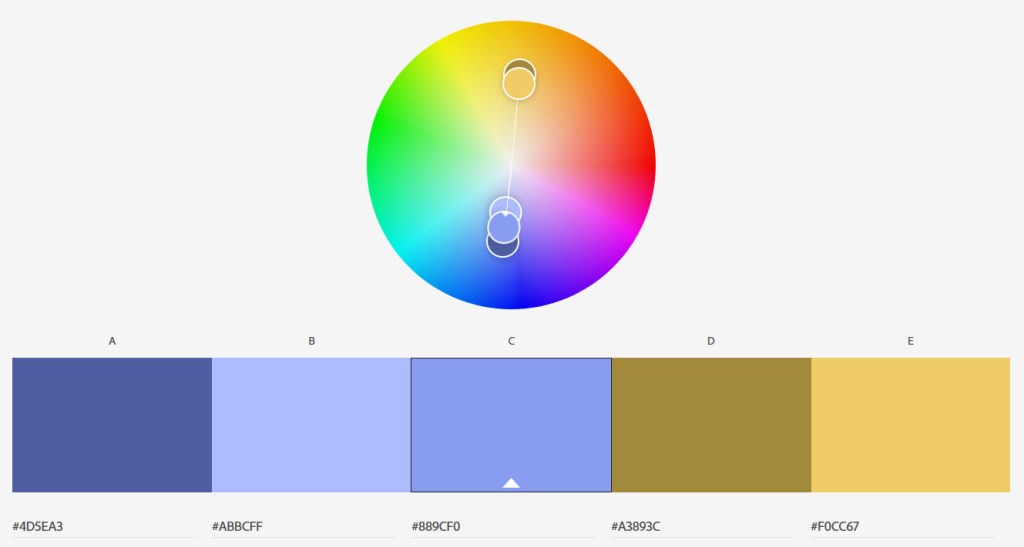
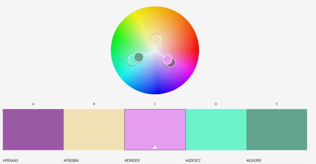
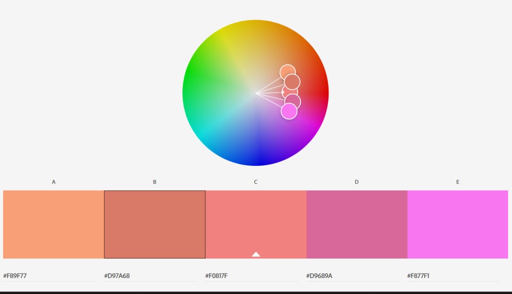
B) Make use of Adobe Colour and develop four different colour schemes. Please hand in screenshots of your schemes:

Monochromatic: Colours that are shades or tints variations of the same Hue(colour).

Complimentary: Usually found on the opposite sides of eachother on the colour wheel.

Triadic: Three hues (colours) equally positioned on a colour wheel.

Analogous: These are colours located next to eachother on the colour wheel.

Week 4 gig poster

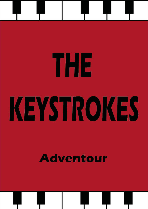
Design a poster for a band’s gig. The band is called: “The Keystrokes.”
You can decide the name of the band’s tour and remember to include a date, a time and a venue.
You can use a visuals and/or typography to design the poster and remember to make the type work with the rest of the design. Show us your type skills in this one. Use an A3 format at 297 x 420mm.

I decided to make a simple design for this, using the colour wine red to catch the veiwers attention, with the band name in the middle and the dates on the bottom of the poster. For the tour name i mashed the words adventure and tour together getting the name “Adventour”. To embrace the band name i added some piano keys on the top and bottom

Expand your design to include a pamphlet that outlines dates and further details of the tour i.e. merchandise available: T-shirts, caps and CDs or a promotion – Free drink on arrival.
Remember this design must be consistent with your poster design. The pamphlet can be any size or format. Have a look online for inspiration.

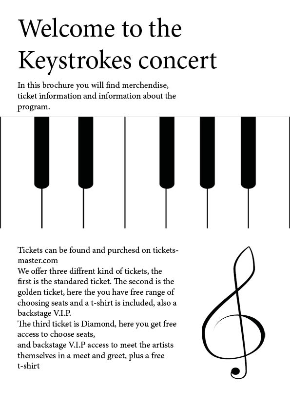
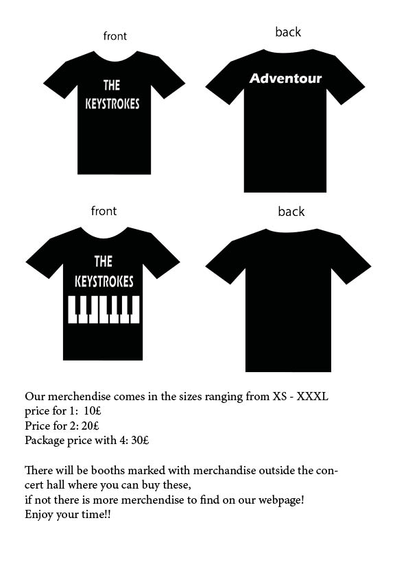
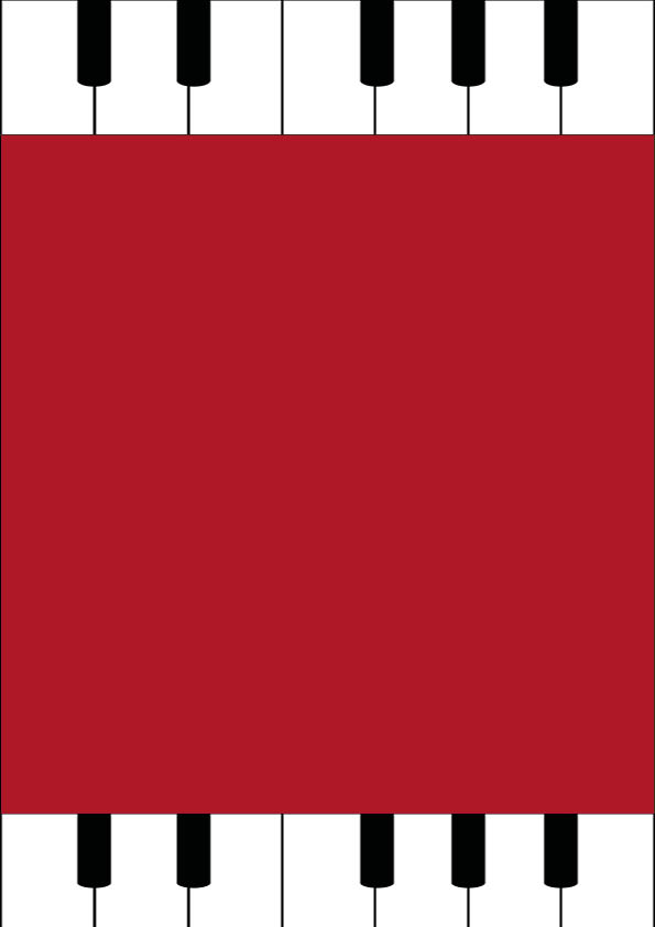
For my phamplet/brochure i used the same wine red colour and the piano keys on the top and bottom, for both the front and back page. Whereas the oages inside containes ticket information, information about merchendice etc. This is what my phamplet would look like:

Week 4 Anatomy of Type

For this assignment, you will need to explain the anatomy of type in a visual way.
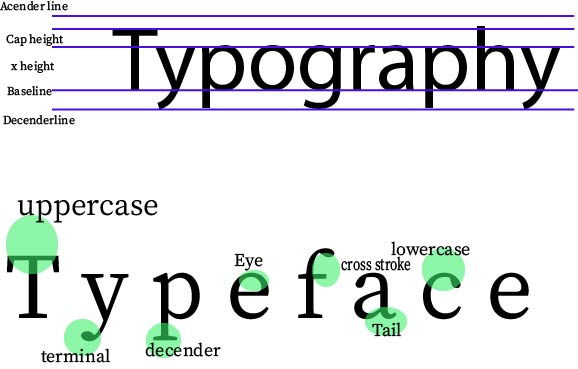
You may use a single unique typeface, or utilise up to three different typefaces for this execution. We would like you to experiment with the design; enlarge or reduce the font size, cut out sections of the various letters or overlap parts – as long as the visual message is clearly expressed to the viewer. Choose three different colours for the execution. Out of these three, choose one main colour. The remaining two colours can be used sparingly or as accent colours. For example, description text could be in one colour, and the parts of the letterforms in the two remaining colours. Show at least three terms on each of the sheets, for example x-height, cap height, body size, counter, serif, ascender, bowl, baseline, stress/axis, stroke weight and bracketed serif.

This is my result:

Week 4 Expressing meanings

Qestion 1

The first question for this task was to make up a new word, that had no meaning to anyone else then me and wasn’t in the dictionary. An example word for this was “Roleean” which means “round and leaning forward”.

I ended up creating the word “Shiblosha” which means “Calming fun” or “Fun in calm”.

Every other word in this composition is round, whereas the rest is normal. I wanted the design to be as simple and minimalistic as possible, yet having some conrast that shows fun. The colour is also giving a neutral calming look to the word.

Question 2

In question two we where asked to pick two more words from this list;

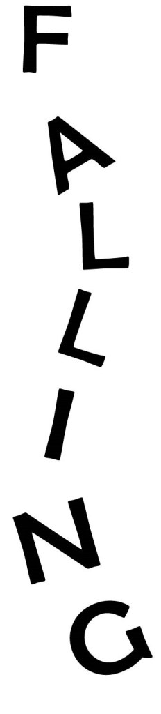
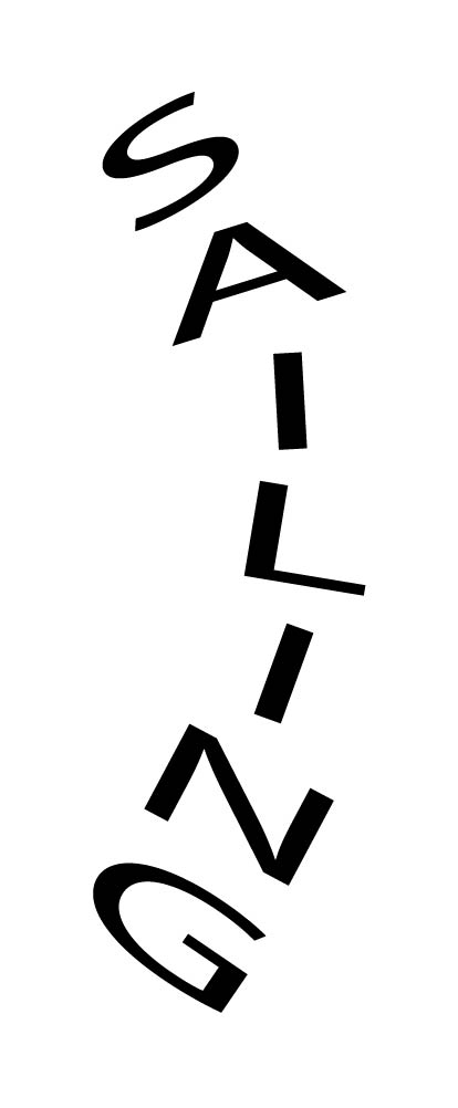
Fluffy, Falling, Slimy, Agony, Sailing, Rock-Solid, Loading, Pizzaz

I ended up choosing the words falling and sailing. We where supposed to composition these two words in ways that reprensent them.

The word falling i made out to look like the letters are falling down.

The word sailing, i made to look like a sail on a sailing ship. It was wither this or making the waves into the letters to reprensent the sea.

Question 3

Question 3 is about showing my process and sketcehes.

I started brain storming, writing down a general idea of what i wanted, then i went on to make small sketches.

Design a site like this with WordPress.com
Get started