Draw up a list of the most important aspects of a product photograph. Refer to shadows, lighting, quality, ISO and editing in your answer. Mention at least five things. You are welcome to include visual examples of discussion points.
The most important parts to consider while taking Product photography is:
The use of lighting, a product photography shouldn’t have hard shadows or light but rather a soft light promoting the product clearly. The distance and size of the product is important as well as the use of correct lighting and reflectors. Use good placemnet, take photo from multiple angels, make sure you can edit the phtos later on.
LT 1.2
Make your own DIY light tent.
Take product photographs of the following objects:
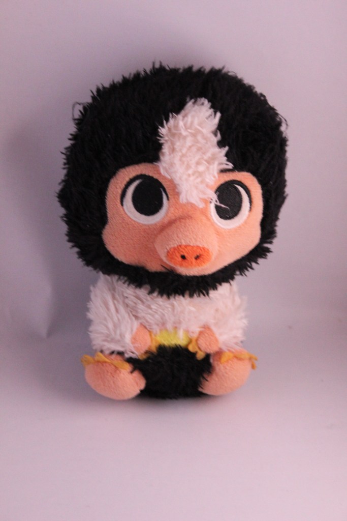
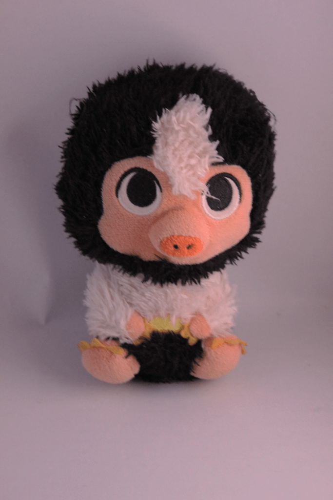
Something fluffy, like a stuffed animal.
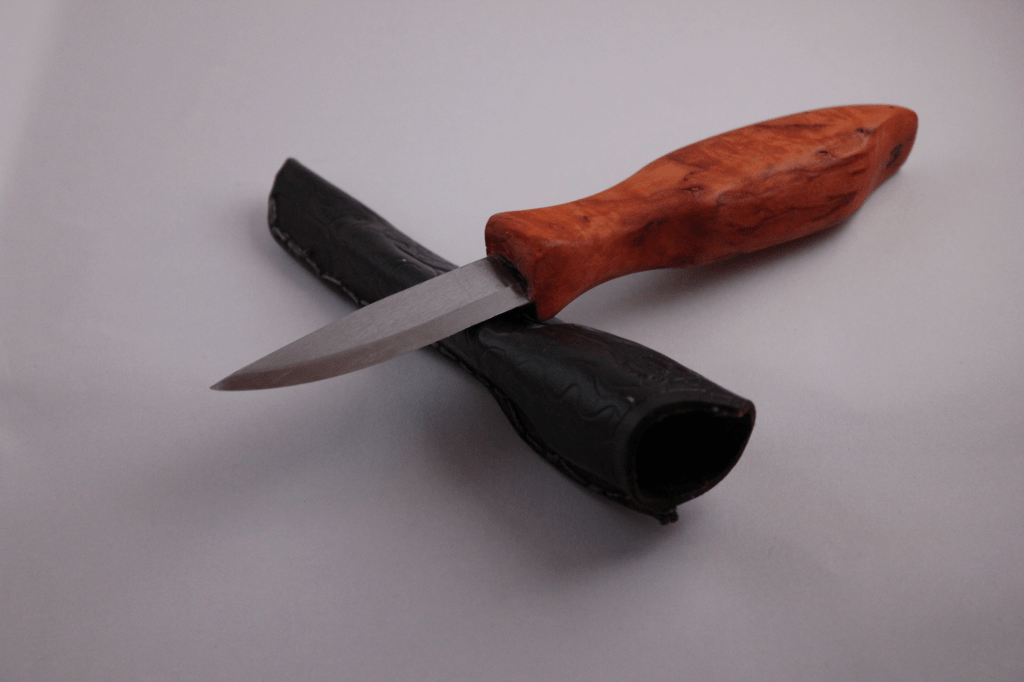
Something shiny, like a knife and fork.
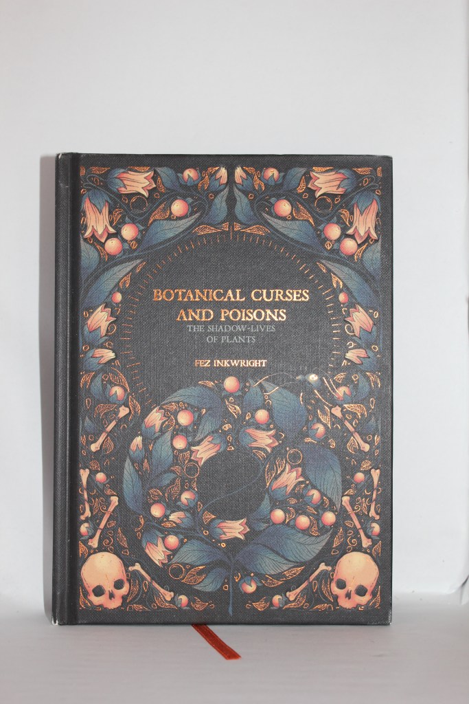
Something hard, like a book or a mug.
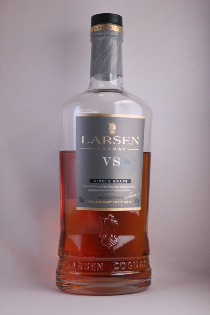
A liquid, like a glass of wine.
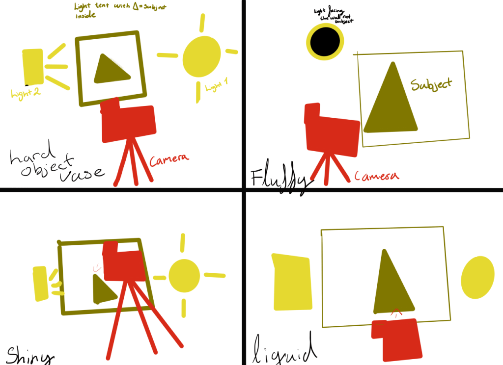
Draw a diagram of your lighting scenario for each of the above photographs and submit it along with the pictures.
Edit your photographs with the software of your choice. Write an accompanying paragraph for each of your pictures and explain what you did during the editing process.
Light tent
Product Photos
Diagram of setup
Edited Photos
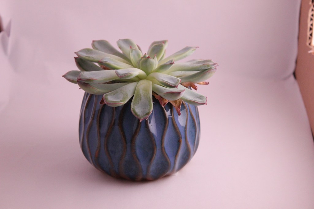
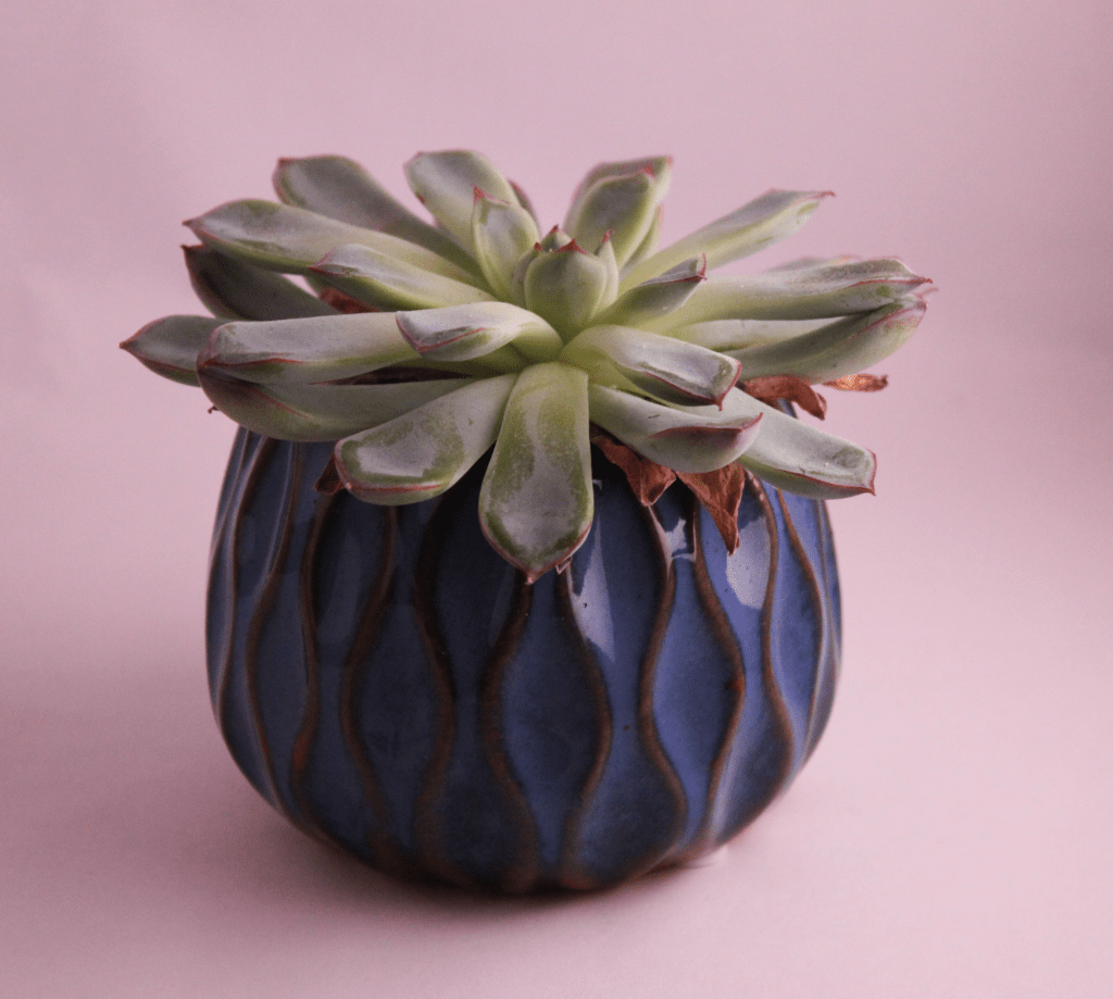
For the plant i simply played around with the curves setting and cropped the photo.
The knife i use hue saturation and contrast to better the photo, i did the same for the liquid photo.
For the plush i change the lighting setting and color corrections.
Your task is to research some influential street artists and learn more about who they are, what they do, how they do it and why they do it. Then, choose a specific street artist who made a conscience provoking message go viral through their art — this might refer to one or several pieces of their art.
You need to write about the following aspects of the street artist. Aim for 350 words, visual examples and references must be included:
Background. How did they get started and make a name for themselves? What inspired them to take their art to the streets.
Speak about their artistic style/execution and the mediums they put their art on, e.g. buildings, pavements etc.
Give your opinion about the art piece/s that conveyed the conscience provoking message.
Speak about the impact it made. Did the artist achieve the goal they set out to accomplish through their street art?
Banksy is the most known graffiti and street artist we have in today’s age. He is a mystery and not much is known of him or his background. I think a lot of people are drawn to Banksy of this reason too. Banksy is a mystery and people like mystery, which makes it easier for Banksy to share their messages and art all around the world.
Background Banksy: Banksy is an anonymous street art that is theorized to be born in Bristol, England. However, this is not confirmed, he is also theorized to be born in the 70’s but again this is not confirmed. Very little is known about Banksy and his background. He first came to notice as a freehand graffiti artist in 1993 and is known for his anti-authority style.
Banksy is most notable for the girl with balloon graffiti, and he has his own style developed his own style using distinctive iconography of highly recognizable images. He uses stencils to enhance his speed.
Banksy art wakes a whole new feeling of rebellion. He is anti-authority, and this can clearly be viewed in his art. All his artwork carries a message whether its policemen talking to rats, the girl with balloon canvas that shredded itself etc. Banksy communicates their message clearly, and the audience can easily read the meaning behind it.
Banksy has reached world wide recognition for his street art, he has also gained a big following which helps his messages come across to the population.
LT 3.2
Of the many tools the designer has at their disposal, the tools of visual styles and the effective application thereof are paramount. Whether designers craft by hand or computer, the physical tools merely aid them in executing their ideas. In other words, concept and style are more important than the physical tools that are used. What we mean by this is not that the execution can be slack when the concept is strong, but that the style and execution should express the concept at its best. Consider the visual overview we have taken on the use of strong and bold graphic design and how this is used to communicate a message with a conscience.
Design an A4 poster for a humanitarian cause you feel passionate about. For example, creating awareness and a call for action against animal cruelty. You must apply pastiche to your design. Use a style of propaganda used during the Modernism era and create your own unique design in a contemporary context.
Start by creating at least five thumbnails for your design. These thumbnails should be handed in with your assignment.
Write a rationale or explanation for your poster of at least 350 words about why it is necessary to create awareness of the humanitarian cause you have chosen and how your design will help achieve this.
Explain your creative execution, be sure to mention the use of colour and graphics as well as typography.
Give examples of the designs you used as inspiration and why they are applicable to your design.
LT 3.3
What fundamentals are used successfully? Describe what you think is the most successful aspect of the illustration (remember to focus on the fundamentals).
My first impression when I look at the illustration, I get the feeling of a busy life lived trough social media and social events, travel, and experiences. This poster gives off a happy vibe and gives off a very fun colourful appearance with the different shapes, colours, and business.
Which style from the past is being used in a new way in this illustration? If no previous style is clearly apparent, does it use some form of pastiche? Why do you think this specific style or pastiche was used? Describe whether you think it was used successfully or not.
It uses a mix of psychedelic colours as well as pop art.
If you had to create this illustration, what would you think about first? (This is before you start designing it on a computer.)
Colour (What would your approach to colour be?)
Line (What would you like to portray with the use of line?)
Composition (What would you wish to instil in the viewer using composition alone?)
I would start with finding colour and shape inspiration, then I would go to composition and look to the real world for further inspiration.
LT 3.4
Design a book cover for a thriller book called “Till Death do us Art” by Ruth Star. This book does not exist, so you can use your imagination regarding the subject matter.
It must be designed by clearly drawing inspiration from a previous design style.
The size of the cover must be A5 and it should include a front, spine and back.
The cover must contain a simple vector illustration that forms the basis of the design.
The cover must contain the title and the name of the author.
Consider what we have discussed regarding Late Modernism in the USA and The Swiss International Style. Do additional research on the Swiss International Style. (It may be a good idea to study some of the known designers of this style and period.) As a guide, visit designishistory.com, which gives a brief outline of specific designers and styles – take note that the Swiss International Style is listed under 1940, which is not incorrect as the style was developed in the late 40s but flourished in the 50s. Also, use additional reference sources of your own and do a write-up of the following:
Research on the Swiss International Style: After you have researched the style, describe it in your own words. How would you define the style? Do a write-up of about 350 words and discuss the characteristics of the style, the prominent typefaces, and the philosophy behind it.
Influences on Swiss International Style: Do a write-up of about 350 words on what you think the main influences were on the Swiss International Style. In other words, what motivated designers to create and follow this style? It may be useful to study specific designers, such as Josef Müller-Brockmann and Armin Hofmann — pay attention to what they (or other designers amongst their peers) have said about the philosophy of the style.
Analysis of the Swiss International Style: Read up on the different schools within the Swiss International Style: The Zurich School of Arts and Krafts and The Basel School of Design and do a write-up of the similarities between them and the differences in their approaches. This write-up should be your own conclusions, based on examples of work and stated facts, and should be approximately 350 words long.
The Swiss International Style
The innovators of the Swiss style combined elements and inspirations from various other artistic trends. This would result in the simplistic beauty of the Swiss style we know today. This style is otherwise known as the international style, and it does rely on using a grid system. However, there are asymmetrical layouts for this style. To go with this particular style, we usually use sans serif family typefaces. And rather then the use of illustrations, the use of photos is preferred.
This style, although it was further developed in the 1950’s by Switzerland, it does originate 30 years prior and grabs inspiration from the Russian suprematism and constructivism. The German design school based off Constructivism inspired work of Bauhaus and the Netherlands inspired style of De Stijl in the 1920’s.
This style was built on the idea that Design should be as invisible as possible, this is so the content and message of the overall design should shine trough rather then the artistic side. This style was very much used post war to gain attention and help brands build a personality after the tragic events of the war.
LT 2.2
Objective observation
During the interview, Marian mentions, “When I worked at Digitopolis, I was working almost entirely on the computer, basically the computer and with photography. And now I am using a wide variety of materials, sometimes still involved with a computer and sometimes just with the materials themselves. But having a space like this allows me to obviously store them all, and to work on these various surfaces in different media.”
What is your opinion on the use of the computer combined with different media? Write one page (350 words) on your opinion of the importance of media and design and your take on the use of computer technology.
Pushing technology and changing philosophy
While describing her style development, Marian states, “I am not an expert on illuminated manuscripts by any stretch of the imagination, but there are a couple of purposes of it. But one of those purposes is definitely to invoke wonder in this way that was very interesting to me and was feeding directly into my ideas about that symbiotic relationship between graphics and text.”
How do you think this links to the philosophy of the Swiss International School? How is it different? Has technology given us an advantage in expressing the symbiotic relationship between image and text? What about Marian’s work? Is this reflected in her work? Do a write-up (350 words) on the relationship between image and text as seen in Marian’s work and relate this to the Swiss International School. Substantiate your answers with relevant facts. You may use a visual example of Marian’s work and that of the Swiss International School to facilitate your analysis.
Objective Observation
My opinion on the use of computer combined with other media. I find it very useful, to not entirely rely on a computer, and be able to step back and use other materials to create your designs. I’m a previous art student, and cosplayer so for me to be able to use a wide variety of materials and have different options for how I work is a necessity. To work only on the computer would be tedious and restrict my creativity, so I do agree with Marian. Working on various surfaces, as well as using various materials creates a lot more inspiration on the subject you’re working on.
When I have to create a design in illustrator, I usually come up with the idea beforehand, and draw it out from my sketches before I scan the design into the computer. This makes it a lot easier for me to work as a generally have a better idea of where I want to go and how I would like to solve the design issue I’m working on. The same for structures on brochures or webpages. I first like to lay it out on a piece of paper with placements before I make it digitally, as it gives me a clearer idea. And of course, sometimes design changes over the course of the process, but usually my template I have crated by hand helps inspire the end results in all my work.
For photos everything goes trough a camera and computer however the motive I am photographing might be made by hand as a inspiration for the current design I’m working on. These are just examples of why a wide variety of materials combined with computer use can be very positive in my opinion when it comes to design. For me personally too, when I have the opportunity to work by hand before I work on the computer it is easier for me not to get distracted by all that the computer brings such as social media etc.
Describe the Suprematism, Constructivism and Swiss movements. There is no prescribed word count; you just need to show that you understand their similarities and differences.
For each of these movements: find examples from their eras and contemporary designs that are influenced by these styles.
Explain, in your own words, how these designs were inspired by the movements.
Suprematism
Suprematism stems from Russian artist Kazmir Malevich. Kazmir hoped to make the most radical new form of abstract art he could, hence the name choice for this particular genre. This genre is very much influenced by avantgarde poets, and an emerging movement within literacy criticism.
Constructivism
This is about how people perceive the world differently from one another. How people process the information given to them trough the media and world and what their experiences build on.
Swiss Movement
I could really find much about this other then it being a swiss watch movement focusing on watches.
We can conclude with where suprematism focuses on elemental shapes and colour to create form, constructivism decides to build on supremacism and take it further by combining paintings and architecture.
LT 1.2
Look at the history timeline at the beginning of the lesson. Gather information from 1900 – 2000 and design your own timeline of the movements during this period, using the Bauhaus Design Style as your theme. Each movement should be designed and described in a creative way.
You have learned about the five steps in the Strategic Design process, they are:
Conduct research
Clarify the strategy
Design the identity
Create touchpoints
Manage the assets
In this lesson task, we will be focusing on Step 1, Conduct Research.
Having learned about the basics of surveys in the past three weeks, choose someone you know (other than yourself. The person may be a family member, a friend, a fellow student, a celebrity or anyone you could physically interview and who would be able to participate in your interview.
Plan the survey: Think about what the Core Interview Questions should be for you to develop a brand for theme. Make sure you get the data on the persona: Who are they? What are their personal goals? How do they define success? etc.
Do the interview: Set up an interview with your chosen individual. Carefully take down all the answers and any other information you might gather from the interview. Type out the questions and answers from your survey.
What is the main goal of the business?
Johannas buisness is a photo fpocusede brand focusing on providing her customers nature photography.
What is it you hope to accomplish with your business?
PhotoHannaJo Hopes to be able to share with the world the beauty of wildlife and nature all around the world.
Who is it you’re trying to reach? (Target audience)
Anyone interested in nature photography and seeing the wild life of the world.
Whats your brands values?
Providing the best service they can for their customers, maintain a good customer relationship and keep loyal and on their point.
LT 3.2
Write, in detail, the following about your client from the previous lesson task (a personal survey):
Attributes
Vision and mission
Key products or services – list these in detail
Key competitors – list three
Competitive advantage
Key stakeholders
Value proposition
Target market
If you feel that you did not collect enough information in your first interview, set up another interview to gather more info.
Gather your findings and analyse the one or two interviews you’ve done. Then type up your results and create a brief. Your brief should include any insight you may have gained from these interviews. The purpose of the brief is to create a brand. (This step is just about creating a brief – you do not have to develop the brand yet.)
Publish your data from the survey and your brief in PDF format. Make sure that the document is neat and well presented.
Design the identity From the research and strategy done in the previous lesson tasks, now use this person’s name to create a logo for them. Remember to keep the previous criteria and guidelines we’ve covered on logos in mind. For this assignment, you should create three logo options (of which at least one should be in full colour). There are no restrictions (such as type-only), so be creative! It is important to treat this as a professional logo for a real client.
Publish the research findings from your survey, as well as a rationale for your logo (a document in which you explain and interpret your ideas). Also hand in the three options of the logos as PDFs and tell us which one is your favourite and which one your client preferred.
Create touchpoints For this lesson task, you do not need to create the touchpoints; only write a list of touchpoints you would recommend to the client for brand development.
Manage the assets Write how you would suggest that the client nurture and grow the brand through the touchpoints you suggested.
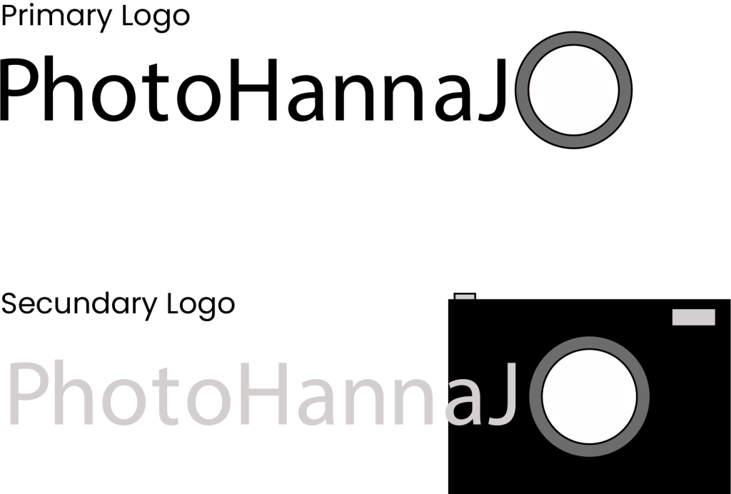
The logos are simple and easy to recognize, they very clearly communicate photography with the photo lens as the O in the end of the brand name, as well as the secundary logo containing a camera. I could hav emade them better but due to our CA i choose to focus on that instead.
Touch points:
Withe the use of social media such as Instagram, Facebvook and Linkdin to portrai and advertise their work.
Getting to grips with the components of visual identity.
Name the three most important components of visual identity.
Describe the difference between logotype and signature.
Using color.adobe.com or coolors.co, create a colour scheme (using only three colours in each set) for the following products:
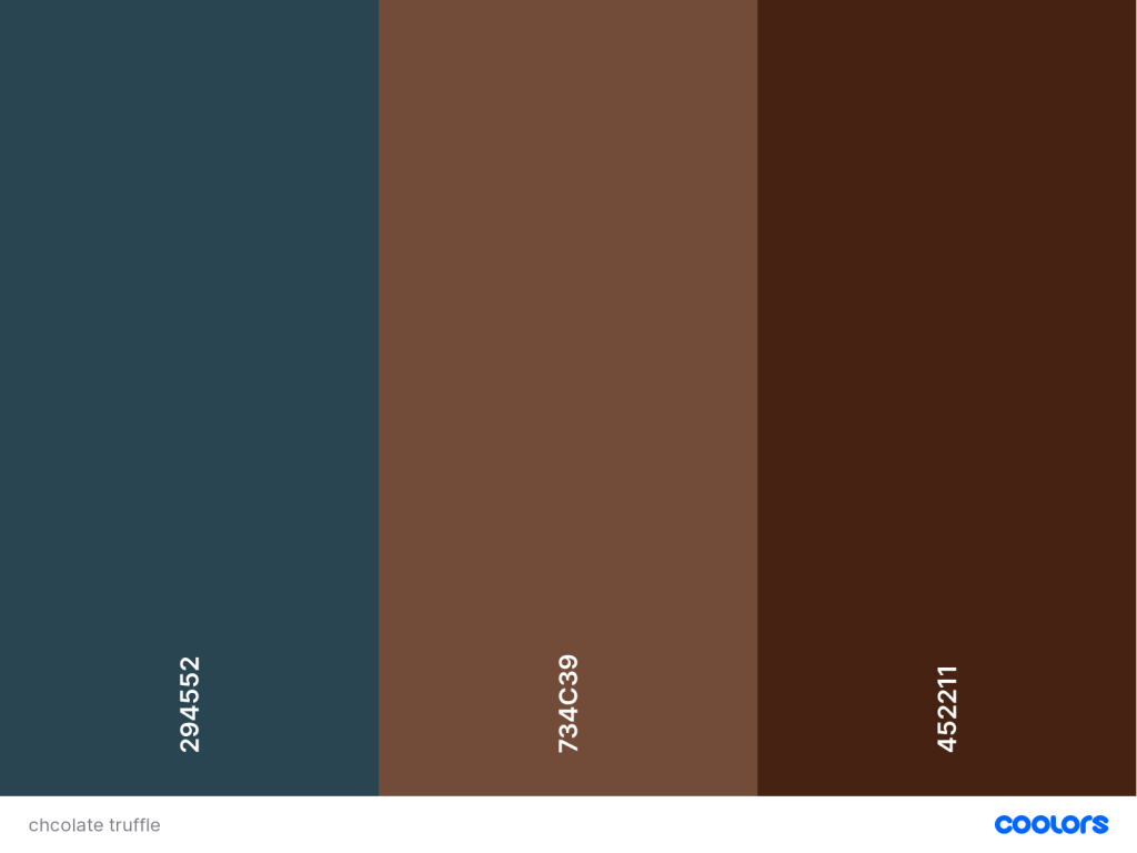
A luxury chocolate truffle brand that is made from real chocolate. The keyword here is ‘quality’.
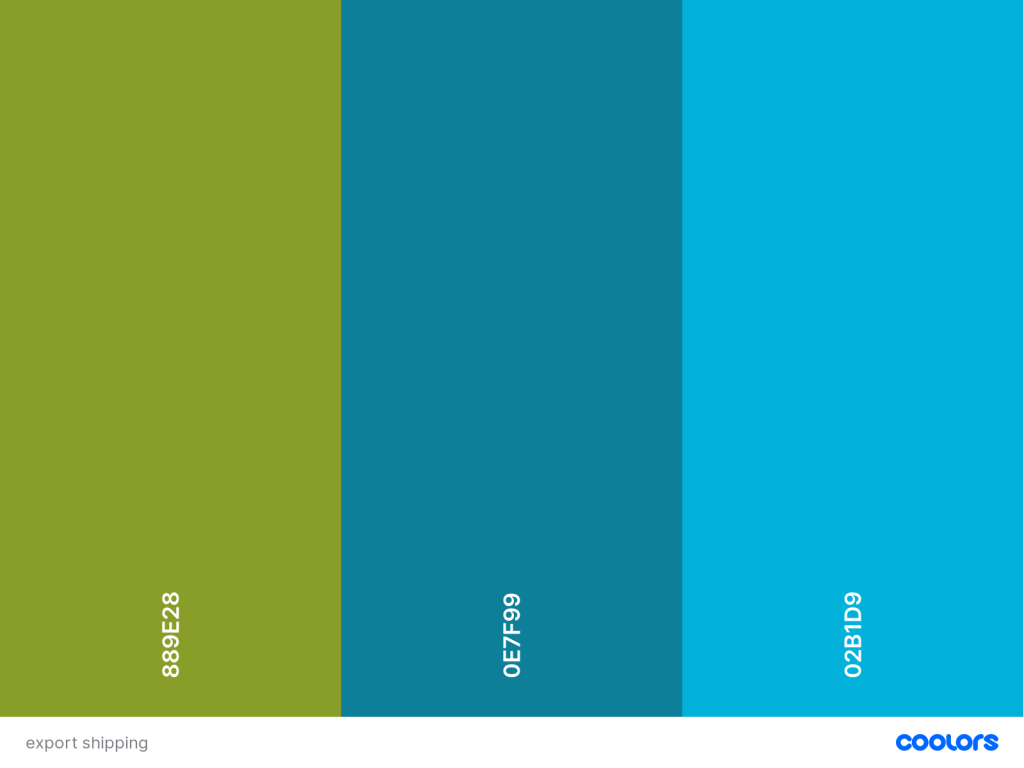
A courier company that delivers internationally by air, land and sea – their main focus is fast delivery.
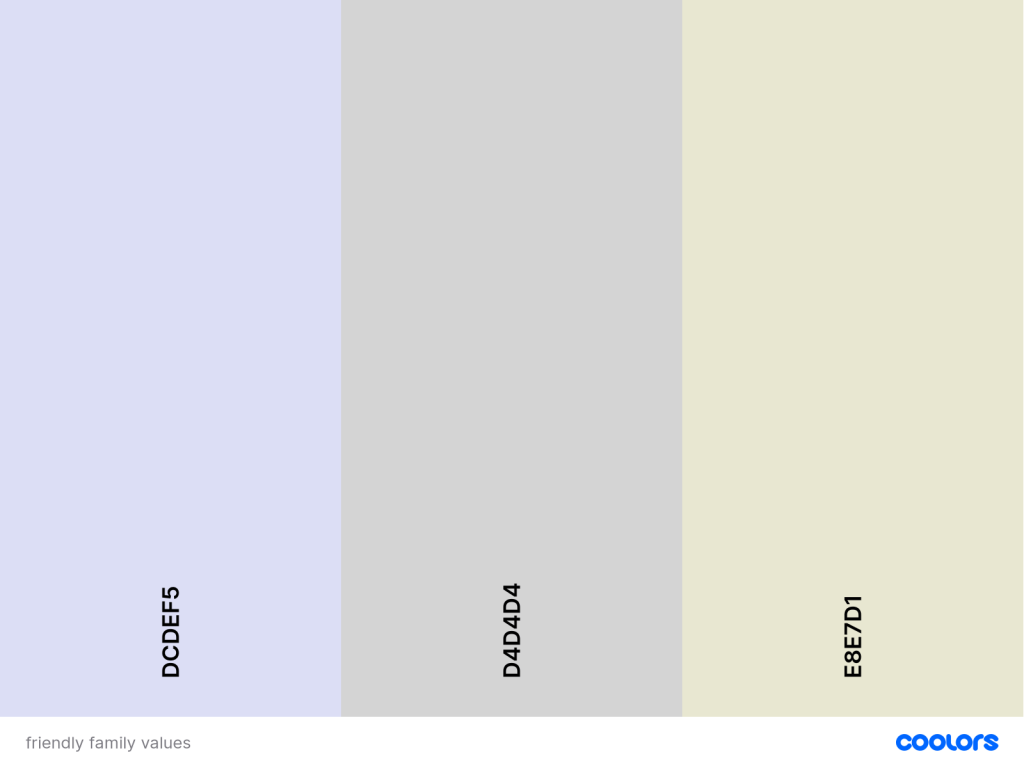
An international insurance company that focuses on family values.
Write your name in four different typefaces, according to the following criteria and write a short description of one or two sentences explaining each of your choices. Use a typeface that:
Expresses a unique quality about you.
Is inspired by your favourite food.
Makes your name look sophisticated.
Connects you to a specific culture or ethnic group.
Getting to grips with the components of visual identity.
Name the three most important components of visual identity.
Logo, typhography, color and imagry
Describe the difference between logotype and signature.
The logo is the symbol and trademark for the brand whereas the signature is a brands name, The signature is important when it comes to signifying approval, feks for a legal contract.
Using color.adobe.com or coolors.co, create a colour scheme (using only three colours in each set) for the following products:
A luxury chocolate truffle brand that is made from real chocolate. The keyword here is ‘quality’.
A courier company that delivers internationally by air, land and sea – their main focus is fast delivery.
An international insurance company that focuses on family values.
Write your name in four different typefaces, according to the following criteria and write a short description of one or two sentences explaining each of your choices. Use a typeface that:
Expresses a unique quality about you.
I added this font, gig because to me it’s noit perfect, its unperfectly perfect just like the road in life. Some to show that life is rocky but you can still rock out.
Is inspired by your favourite food.
Here i used to font poppins, its bland, and goes for anything as i dont really have a favourite food.
Makes your name look sophisticated.
Here i used the font vivaldi italic. This font to mee looked overdramitcal and pretty, sophisticated in my eyes. I quite like this, the big circles remind me of a big ball hall with people dancing in fancy dresses.
Connects you to a specific culture or ethnic group.
I couldnt find any font that would do this for me.
LT 2.2
Observe and learn how leading brand names work with visual identity.
Choose a well established, international brand name. Some examples are H&M, Nike,Amazon, KFC, Mercedes, Virgin, Sony. You are free to choose another. Research the history and origin of the brand name and write down your findings.
Compare the history of the name with the current logo and brand.
Write down your own conclusions about how the logo relates to its history.
amazon first started out as cadabra inc. however the lawyer helping Bezos with this missheard the name and wrote down the name cadavre inc. So bezos changed the name yet again to Relentless.com, whichg he actually bought. But after his friends claimed it was too sinister he settled on the brand name we know today Amazon in the 90’s. And so it started building itself.
Now write about how the logo or brand relates to its current target audience. Note if anychanges were made to the original brand to achieve this or not.
Amazon first started out as a bookstore, but latyer moved on to offer a little bit of everything shipping all over the world. Amazon is a easy to use handy company that offers a easy way to find stuff you may not find in your local stores. The logo is easy to recognize and reprensent them well, the audiance will automatically know what its about. its a good but slightly boring logo.
Collect examples of how this brand is applied across different platforms with at least fivedifferent touchpoints (for example, digital campaigns, social media, large format, signage,packaging, specialised campaigns and so forth). Discuss how a consistent visual identity was established across the different touchpoints. Consider the brand application in terms of logo, icon, colour, type, texture, photography etc.
Amazon marks their packaging with their logo and uses their own boxes. Easy to recognize.
Amazon creates adds according to your amazon search history where they personlise the add to fit your intrest making it easy for them to make small adds pop up on other social media such as instagram.
LT 2.3
Design according to a Brand Manual.
Pretend you’re on the editorial team of an airport company’s inflight magazine. The magazine is funded by advertisements, and the marketing team wants to pitch marketing plans to possible advertisers.
For this, they want to present examples of advertisements inside the magazine to the clients they approach, showing them what an advertisement inside the magazine could look like. You must apply the brand rules of these companies religiously.
You need to create two full-page magazine advertisements for this campaign. The first advertisement is for Starbucks. Here is a link to their online brand guide: https://creative.starbucks.com/.
Create some names for ice cream. The brand has a range of different flavours, but the unique aspect it should communicate is that it’s the coldest ice cream in existence.
Now come up with five name options for this product (you shouldn’t spend more than a few minutes on each name) using inspiration from:
Latin 2. Colours 3.metaphores 4. Sience 5. Myths
Latin – frigida glacies, which means Ice cold in latin
Colours – Shattered Ice – taken from the shattered ice colour #daeee6
Metaphores – Freezing cold, as for the ice cream coldness
Sience –
Myths – Chione, named after the greek godess of snow.
LT 1.2
Design strategy takes form in life. Rent and watch the movie ‘The Greatest Movie Ever Sold’ (the official title is ‘POM Wonderful Presents: The Greatest Movie Ever Sold’) and answer the questions below.
Question 1:
Do you think the movie provides insight or detail into what drives product placement in entertainment? If so, what have you learned from that? If not, how would you change aspects of the movie to reflect insight on this?
The movie clearly shows how products are used and promoted in todays media. By putting clearly marked and easily reconized products in popular media such as the avnegers movies, the brand is guaranteed more attention regarding the product. It’s mpre or less a way to market their products trough the enjoyment of feks movies, tv shows etc. In other words a wonderful market strategy. I have learned to keep an eye out for product placement in popular emdia and how it’s portrayed and how it eventually can be used.
What have you observed about presentations of visual strategies/brand identity?
The products are often portrayed in positive lights, they are requierd to follow the guidlines following the contract signed between the manufacturer and the people making the movie/show etc.
Let’s consider this movie as a form of research. In other words, it was done to see what the effect of branded entertainment would be, a case study of sorts. What are your findings? What have you learned? What has changed your pre-conceived ideas? Do you think this case study is relevant? How could you apply your observations in real life?
The case study is relevant for it shows how important product placements are to the media being created. Products placements work more like sponsorships where a brand or multiple brands will support a media with funding and products in order for the mdia to be created. It’s also a way for brands to market their products to a broader audiance.
Question 2:
Pick a local restaurant, coffee shop or bakery in your town. Using the findings above, create one complete strategy for a small activation campaign to advertise your client or a newproduct to the local community. You can direct your campaign at local schools, train stations or an event. Give one idea of how you would do this by following the five steps of the work process. To guide you, follow the points below and do a write-up of your idea and the steps you followed:
Conduct research – Think of relevant research that will be needed to develop the strategy. Also, think of quick research methods, such as surveys for family and friends.
Braud og bollar is a small local cafe chain, that only operates in the county of møre and romsdal. It is a cafe focusing on homemade pastries, espcially sour dough breads. They make their own pastries daily in the cafe to offfer their customers freshly baked goods. They advertise their brand on social media such as facebook, as well as giving out adds in the local news paper and flyers.
Clarify the strategy – Once you’ve conducted quick research, do a write-up of your findings and create your own brief.
The mission is to create a acticvation campaign to advertise their products. This will be done at the local school. This will be done by setting out flyers, as well as bringing free taste samples to the local school for the students to try.
Design the identity – Here, you don’t need to go into lengthy design, but create sketches of your ideas and remember to think about the movie for inspiration.
I would deisgn a menu flyer for people to see what they offer, as well as a busniss card that can be distrrubeted to the audiance.
Create touchpoints – As this is a focused campaign, you may have one touchpoint only; describehow you would activate your campaign using this touchpoint. If you need to, you may do sketches that would aid your communication.
i would create busniss cards and flyers for the students to take home, as well as menu so that the students could bring home with them and locals would have more options to see what they offer.
Manage the assets – As this isn’t a prolonged campaign, briefly describe how you would use thepossible outcome of your campaign for future use. Also, state what your follow-up steps would be to strengthen your message. For example, how would you collect feedback from consumersor communicate to them to continue to support your campaign?
Theres a lot of things that can be done for the campaign to gain more attention and for the audiance to become more informed about the cafe and their offers.
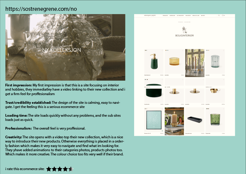
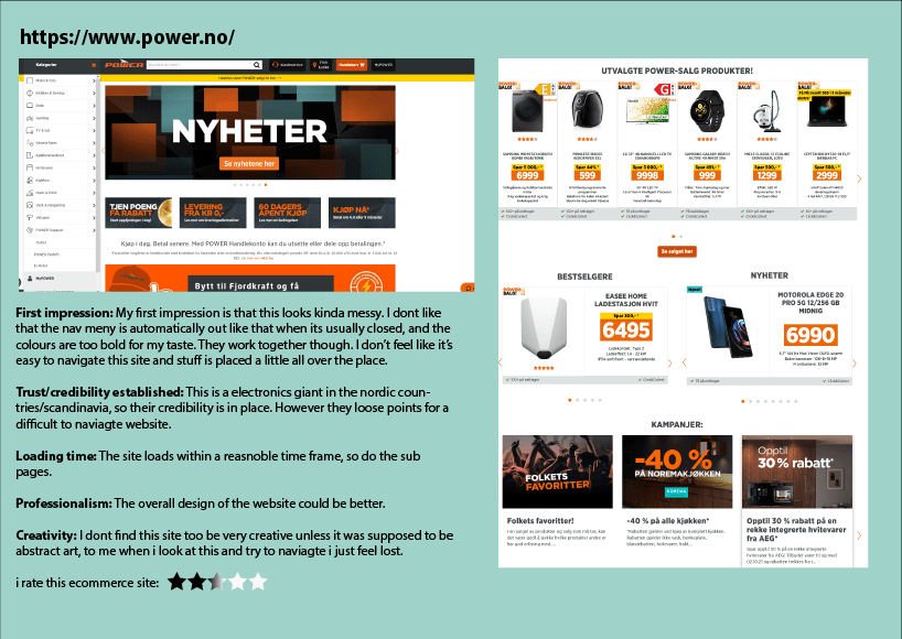
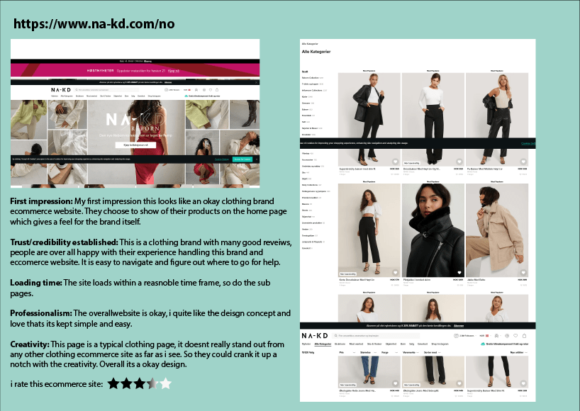
For this lesson task, you must review three e-commerce websites, preferably small businesses (not in the category of Amazon or Walmart, please). Give star ratings out of five for the following categories:
First impression.
Trust/credibility established.
Loading time.
Professionalism.
Creativity
LT 4.2
Choose two e-commerce websites from different retail sectors. Create a diagram illustration of their category trees. Your diagram should clearly indicate the different levels of categories, as well as product attributes.
LT 4.3
Which are your favourite e-commerce sites that you use regularly? Pick one to focus on for this lesson task.
Think about the functional design and discuss why each of the following pages is effective:
Home page.
Category page.
Product page.
Cart.
Checkout.
Post your conclusions about the effectiveness of each of the five pages to your WordPress blog and share screenshots to support your written findings.
I, as many others, use a variaty of diffrent e-commerce websites on almost a daily basis. Among mine lies Amazon, Etsy, Zalndo, Outland and many more. For this LT i have deided to focus on Etsy. Etsy is a e-commerce site that gives small busnisses/private people a platform to sell their art, products etc on.
Lets start with etsys homepage:
Right off the bat Etsy provides you with a selection of interesting and handy products, made by small buisnesses or private people to sell. Thier homepage is divided into sections with diffrent directions you could go to help you find what youre looking for. The home page also contains a section of information to what its used for at the bottom of the home page.
Their catagories can be found in the nav bar, as well as down on the home page. they are easy to find and the site is easy to navigate as well as their app. If you hower your mouse over the nav bar catagories you will have a drop down menue with more options.
Products: As said this is a global market place containing many different items and products. their products are placed neatly in order and nothing is messy.
Their cart is easy to use and find, they have a small cart illustartion in the top right corner of the site. The check outsection too is fairly clean, and showing payment options in a orderly fashion.
Developing an eye for good and bad design is key for any designer. This is what sets great designers apart from average ones.
This task will help train your eye to notice the finer details of your designs and where they need improving.
Breif
Find two websites: One that shows good typography design and another one that doesn’t. Then explain why the good one is good and the other one is bad.
You must do this by taking screenshots of the area you refer to and writing a brief explanation of what you have noticed and why it’s either a good or bad typographic design.
Make this as detailed and extensive as possible. Remember, you’re training your eye for design to pick up the little things and the big things. The more you notice, the better!
Bad typhography
This website in itsel has a lot of issues when it comes to design choices. However i am to focus on the typhography of it. Theres used several diffrent fonts in doffrent sizes of typhography, this makes the writting very confusing and i honestly dont know where to start looking or reading. There is also an issue with how many diffrent colours the letters are, this makes it blurry to watch.
Some of the fonts have shadows behind them, this is okay in the riught setting however on this website this does not work at all. The same for the fonts coloured two diffrent colours. Non of the text is clean, its placed rather messely around the whole site, and it looks like a big chunk of text.
The colour choice for the fonts could have been consisten rather then just thjrowing so many options out there the target audiance wont know where to begin. This website feels like a very big cluster oif mess, and is overall not good at all.
Example for a good website
This website has a very cleane simplistic design, their fonts of choice fit very well in with their brand and they keep their fonts consistent. No changing colours, no messy shadows behind letters. I over all like this font choice for a coffee shop, as this gives me a very calming feeling.
I know where to start reading in this sight and the letters float easily in front of my eyes, unlike the previous website where everything was just messily floating everywhere with no structure. This sitew has a very nice structure to it.
LT 3.2
You need to design a complete home page for a website of your choice. In this task, you’ll need to focus on the effectiveness of your design above the fold.
The website design, however, can only include typography and graphics – no photographs may be used. This is to help you think outside the box and develop your creative thinking.
You’ll need to come up with your own headlines and sub-headlines. You can use Lorem Ipsum for body copy.
as i am not done with this design yet i will upload it as soon as its done.
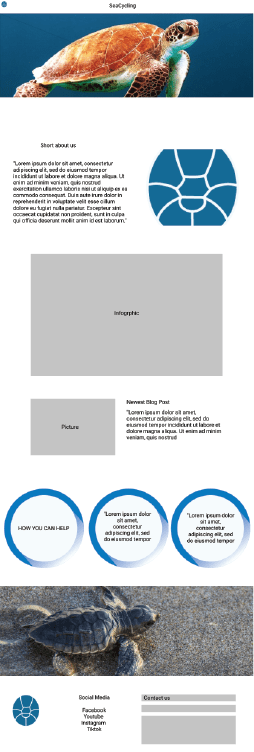
my idea was to create a story site, a small site telling a short story of a fox, i made a drawing for the illustration but didnt get much further due to health issues.
LT 3.3
Create a report outlining how you have optimised your website for performance. Referencing Lesson 3 (Designing for performance), explain how you have optimised your site to ensure it performs well.
You need to address as many categories as possible from the lesson that are relevant to your site and demonstrate your understanding of the principle.
For your images, you need to include things like pixel dimensions and file size, for example. Be as detailed as possible.
I would optomize my site by keeping the design on point, to the main idea i had. Keeping the site simple and easy to navigate. Not to much clutter. Use a reasnobly sized and good quality illustartions to showcase what i wanted too.
The site would be a one page website, neatly put together for the story fo the little fox. The background would be kept a soft colour, the largest images would be no more then 1mb
LT 3.4
Using the website home page you created previously, add triggers, interactions, and animations to provide a more engaging and exciting user experience.
This too i was not able to do due to health issues.
Write a summary about the importance of organising your content and assets (images, logos, icons, graphics and text). Then, take a screenshot of your folder structure to show how you organised your content for this website project. Note that these files need to be organised before you start building your website in Webflow.
Take screenshots of your Home Page in your Figma prototype and then of your Webflow Home Page to show how you’re moving along. Please write a short comparison of the two and how hard or easy it was to build what you have planned.
Write a summary about the importance of organising your content and assets (images, logos, icons, graphics and text). Then, take a screenshot of your folder structure to show how you organised your content for this website project. Note that these files need to be organised before you start building your website in Webflow.
It is important to keep my files organized so that they don’t get lost. I organize it by the type of file in different folders so that it’ll be easier to know where to look when I need the different elements.
Take screenshots of your Home Page in your Figma prototype and then of your Webflow Home Page to show how you’re moving along. Please write a short comparison of the two and how hard or easy it was to build what you have planned.
Figma Prototypes for web and phone
LT 2.4
On your website blog:
As you did in Lesson Task 2.3, show screenshots of the page/s you are building in Webflow next to the matching page of your Figma prototype. Then, briefly write about how you’re experiencing Webflow. Share what you’re enjoying and what you find challenging.
I sadly havent gotten started in Webflow yet due to health issues but will be right on that as soon as i can.
As for how i am experiencing webflow so far, it is very unfammiliar for me, and im following toturials as best i can to learn it. However i must say i do prefer to code my own websites. I feel a better sense of control then for what i am doing.














 stinesreflectivejournal.art.blog