Symmetry/Asymetry
In this lesson task im testing my sketching skills.
- On an A4 landscape page, draw four equal squares. Create 4 more pages in this way. So, you’ll have 5 pages with four squares on each.
- Draw one or two squares or rectangles in each empty square to achieve the visual effects that you see on the first page of module 3 in Graphic Design School textbook. You can work with the interaction of rectangles and squares to make the balance or imbalance more evident.
- Entering left
- Movement to the right
- Movement to the left
- Movement downwards
- Movement upwards
- Balance
- Tension
- Symmetry/asymmetry
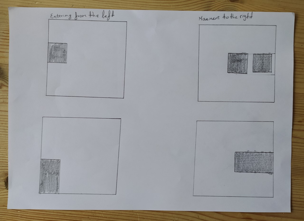
On the left side, the boxes are entering from the left, on the right side the boxes are moving to the right.

On the left side here the boxes are moving to the left while on the right side they are moving downward.

Here theboxes on the left are moving upward while the boxes on the right are creating a balance.

This shows the symmetrical on the left and asymetrical on the right.

Here we can see a bit of tension on the left while the right is showing balance again.
Basic principles of layout
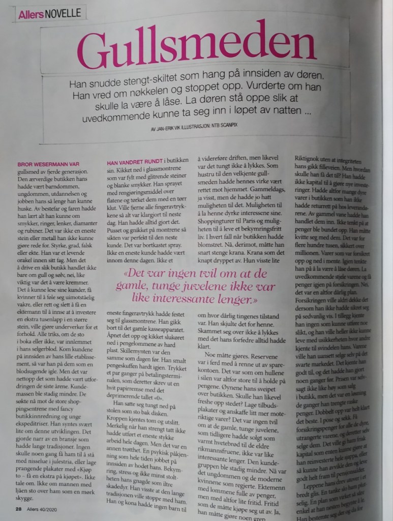
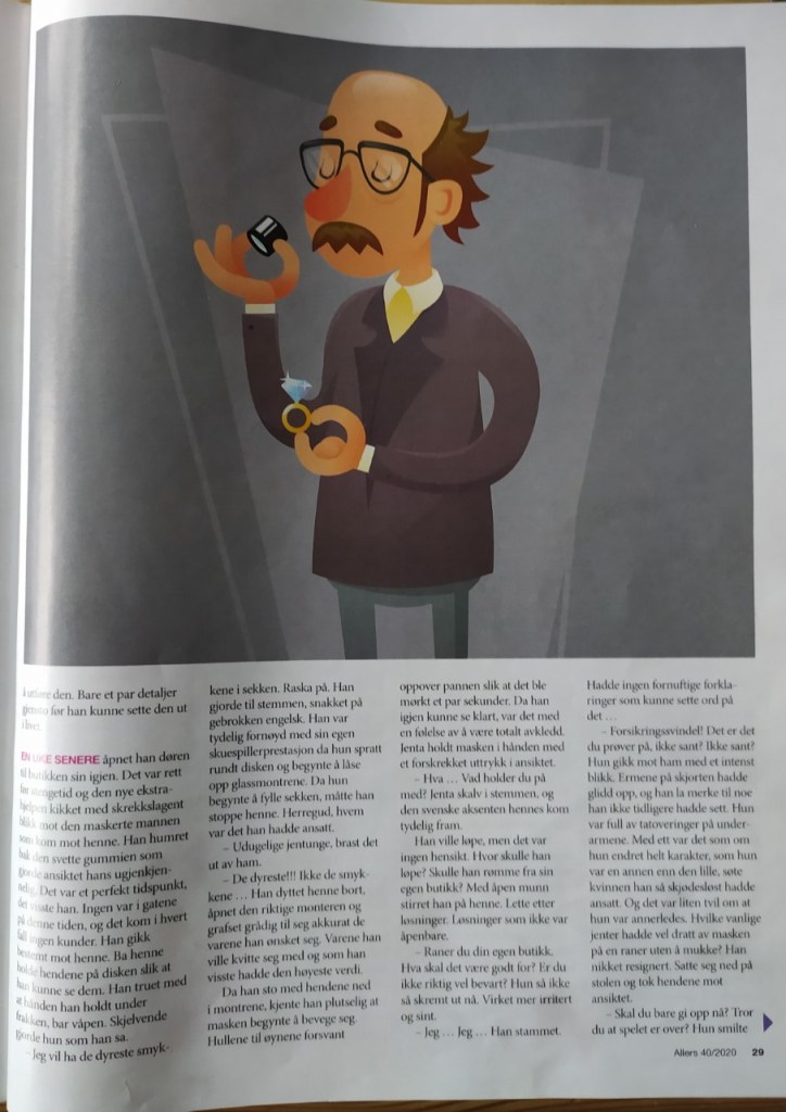
- Take a magazine, newspaper or book that includes images and text. Lay tracing paper over the top of three spreads (both left-hand and right-hand pages). Using a pencil and ruler, carefully trace the grid underlying the page layouts. Remember to remove specific text elements or images, and to only draw the grid lines. Note column widths and margin sizes at the top, bottom, and to the left and right of the main body of text. Is your document based on a two-column, three-column, or another type of grid? Which elements stay the same on each page, and which change?
- Publish your findings to your WordPress blog and provide photos or scans of your exercise.



Pace and contrast
Compare the design (in terms of pace and contrast) of an online magazine, blog or website to that of a printed magazine, book or journal.
- What differences can you see between the kinds of design strategies used in the two formats?
- Write down your findings and upload it to WordPress.
Usually for printed magazines you can find they layout to vary, depending on the publisher, environment, and audience they are trying to reach. This makes it very unpredictable to know how a magazine will be seen before opening it. You will often find printed magazines to contain different structures on each page, and in general contain more information then just the theme of the magazine.
Online magazines however should be simple and easy to read. Usually the structure of an online magazine will stay the same, making the pages easier to navigate. This will also make it easier for different devices to open the pages. Good headlines catching the audience attention are also important here.
Form and space
Rearrange shapes cut out of paper, and try to find the point at which the figure disappears into the ground.
- Cut out a series of shapes from black paper – squares, rectangles, circles and random shapes – in a variety of sizes, from small to large.
- Working with a square piece of white paper, place shapes of different sizes into the white space; place them on the white one at a time and move them around.
- Try to find the point where the distinction between figure and ground becomes unclear. Does it depend on which shape dominates the space: black or white? Is it about the position of the shape within the space? Think about how important figure-ground relationships are within composition and design.
Write down your findings, and remember to take pictures of your progress. Submit these pictures and your write-up on your WordPress blog

So i started playing with the shapes to find where it starts to become more unclear.

I thought id also include an example of where the shapes can clearly be distinguished


In these two however, you can see them becoming more unclear.


Here i added siffrent and many shapes, and it became very unclear
Design of layout in InDesign
Using InDesign, design a 8-page brochure for a fictitious travel agent.
- The size of the brochure should be A5 (when it is folded).
- Design the brochure in full colour.
- Use fake body copy, but create sensible headings.
- Use titles, headings and images of your choice.
- Be sure to pay attention to:
- Choice of type
- Choice of imagery
- Use of layout and grid to communicate the content
I chose to upload a pdf of my layout, this is my result
 stinesreflectivejournal.art.blog